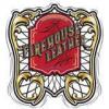
FHL FERG Report post Posted May 11, 2012 Trying to decide on a new logo. Let me know your favorite and I am very open to any feedback or suggestions for tweaks and changes Quote Share this post Link to post Share on other sites
Cyberthrasher Report post Posted May 11, 2012 I voted for #3, but I think it needs the full "FHL" from the 2nd one instead of just FH. Since your name is Firehouse Leather, having the FH alone feels like it's missing something. Basically, I think the white lettering for "Craig Ferguson...." works better because it helps draw the eye and it just looks cleaner. When I first opened this up, before opening the pictures, my eye was immediately drawn to that thumbnail. The first and last just have too much going on. They're cool, but I just don't think they do you justice. Plus, it seems obvious when you stop and think about it, but some people might not associate the ax with a fireman's tool immediately. 2 and 3 have a fairly recognizable design and it would be a LOT easier to work into a maker's stamp down the road. The more I think about it though, the lettering minus the ax on the 4th one could be a cool header for a web page. I've been thinking about this stuff a lot lately since I'm in the process of designing my own, and unfortunately you actually used all of the fonts I was considering Quote Share this post Link to post Share on other sites
Sylvia Report post Posted May 11, 2012 Hi Craig Is this logo for your website, business cards... and other publications? If so you are going to pay through the nose on any of them to have them color printed. The printer will have to strip the image down to the color layers and they will charge you for that process. Then when they print... you will pay a set up charge for each color. Now, do yourself a favor and turn each of these logos into black and white. See what it looks like. I would be willing to bet it all becomes one grey black blob. The whole idea of a logo is to have a symbol that will instantly identify the company. Think of some of the big companies like Apple, IBM, and Merrill Lynch Apple is instantly recognizable and so they don't have to put "Apple personal computer company and other very cool electronics" on their logo. Essentially, this idea is "KISS" or Keep it Simple Sunshine. I hope this helps. Syl Quote Share this post Link to post Share on other sites
Glendon Report post Posted May 11, 2012 (edited) As far as style goes, I much prefer the two patch designs. Very fitting given your name, and pretty memorable. I'll give the same advice as Cyberthasher. I would go with #3, but use the full FHL initials. That way it will stick in someones mind better what the initials stand for. #1 and #2 feel much too busy for me. Too much going on to take it in quickly. Edited May 11, 2012 by Glendon Quote Share this post Link to post Share on other sites
ironhead13 Report post Posted May 11, 2012 (edited) With what has already been said #3. With FHL, but find a cleaner font for the FHL initials, it's too broken up and looks sloppy. I also like the first axe head. But to much red lettering. The third axe head has to much back ground in the axe head. Instead on using the same for over again, for the .com portion use a simple arial or similar font. Or, I'd use the axe head for small graphics areas with just the name in it. A more pronounce or over exaggerate axe head would be more memorable. The blue back ground kills them all together in my opinion. More often than not a solid logo, is simple. Think about a billboard as you pass it going down the interstate. Did you have enough time to read it and get the point across? I'd probably loose the tooling designs in them as well, or limit it to one pattern with the leatherish back ground. On a design stand point, be mindfull of your resolution. Alot if not just about everybody makes their graphics for the net. When it comes time to, say, print a t shirt you could have yourself back into a corner, bands are the absolute worse when it comes to this. Always create a "master file". Large resolution, 300dpi and a good inch measurement (say over 10 inches at minimum) and keep that file in layers, you can downsize a copy for your needs from there. An image can always be made smaller without degrading it. But an image cannot be made larger without hurting it. Unless it is vector art, which the above is not. Just different suggestions to "maul" over. Edited May 11, 2012 by ironhead13 Quote Share this post Link to post Share on other sites
mlapaglia Report post Posted May 11, 2012 A good reason to not use #1 and #4. When I looked at them I did not see an AX head. I looked at it left to right so only saw some strange shape that kinda fit the letter shapes. Go with #2 or #3 Quote Share this post Link to post Share on other sites
DoubleC Report post Posted May 11, 2012 I liked the way you lettered the bottom of 4, so voted for it, but after reading Thrasher's post realized why, it's the white lettering. What I was going to recommend was that you put your name separated by the A coming down but not the site. have it in a straight line. And I'll admit, I didn't realize it was an ax either so probably shouldn't take any of my advice :-) Cheryl Quote Share this post Link to post Share on other sites
rickybobby Report post Posted May 11, 2012 Ferg, Looking at your designs made me search for "logo trends" on Google. I am facing the same thing you are, trying to create a logo and a recognizable "Brand" look for my shop. It is not a simple process! I know you have spent several hours/days on this and the work shows that but there are some other considerations you may consider. I have a friend that is a graphics artist and owns a sign company here in Phoenix http://www.signsthatsell.com/ He has seen the trend move towards minimalist typesetting and fewer colors with little or no bleed off of color. The "Bleeding Cowboy" font has been very "over used" (Ray's words) and is so 2007 (again, Ray's words) it dates your logo/graphics quickly because they have been seen for a few years already. They were new, used a lot, looked really cool, now they are not! Kind of like the "mullet" hair do! Classic stays, trends grow tired. Your designs are very imaginative and show that you are detail oriented and trying to bring as much info about your business to your customers as you can in a limited amount of space. The message gets lost in the artwork (JMHO). Others have observed that as well in replies. I have been looking at past leather business maker stamps for many years repairing saddles and tack. Some of the finest work out there has the simple maker stamp in an oval or a circle with the shop name (or persons name) city and state. What draws you to look for it is the work. When an exceptional saddle comes to the shop it stands out, even from 10 feet away, even if it is plain and sitting next to a bunch of full carved production shop saddles. People will notice quality and will start looking for the maker stamp. I am finding that more of my "plain" work appeals to a broader audience than tooled work (and sells quicker) (my tooling is o.k., I'm not a Bob Park!). We as artists appreciate the tooling and artistic aspects of leather work, the public (at least 80%) like more plain work with an edge boarder line or a simple cam tool edge. There are exceptions to that statement and I realize that too. Knowing your audience helps define what you make and what they will like/buy. Ferg, I think maybe some changes to simplify the logo may be an idea I would consider. If it looks good in a vector image (black and white only) it may be more appealing to a broader audience and quicker to recognize. Your name You city, state Fire hat shield shape border Axe surround shape for border website address Not all of these elements at once!, pick two or three that are most important to you. Put together 4 or 5 ideas (in vector image) and remember that your maker stamp will be what most people will see. Save colors and additional information for a website or facebook page. This is a learning process and I can appreciate how much time you have put in to this! It is not and easy task! Quote Share this post Link to post Share on other sites
Spinner Report post Posted May 11, 2012 My initial thought is you've created your business card, just need to add your phone number or email address. A logo is generally a simple graphical representation of your company's identity. I should be direct enough that a client looking at it can immediately identify it as yours. What you've created provides multiple identities that the viewer has to connect together to figure out what they are looking at. Here's what a first time viewer sees and has to identify: 1) FHL 2) Firehouse Leather 3) FirehouseLeather.com 4) Craig Ferguson * Leathersmith The first question I would ask if designing your logo would be, "which of these four entities is your main identity?" i.e. - what do you want people spreading word of mouth to call your brand? Once you figure that out, design around that and leave the rest for the website & business cards. Keep in mind also, that many good, memorable logos don't include the company's name at all or it is the logo by itself. Every design article will name the standards, Coca-Cola, VW, Nike, McDonalds, Shell Oil, IBM, Apple. Here are a few more industry specific ones you'll recognize as well: Danny Gray, OCC, West Coast Choppers, Harley, Honda, Indian, Jesse James' FTW, etc. think about what they all have in common. Heck, you can even look here on LW.net for some great examples: Bobacat & ARM Leather. Why are they great? Because I remember them off the top of my head and can tell you what each looks like without reference. In fact, a google search shows what extent Andy went to in designing his logo, he had his design critiqued by an actual logo/graphic design forum...now that takes guts as designers & artists can be brutally honest with critiques when they don't like something. http://www.graphicdesignforum.com/forum/archive/index.php/t-43249.html Also, check out some articles on best practices and common mistakes. It's OK to and sometimes it's advised to break a rule or two but you want to make sure you don't end up wiping your arse with the rule book either. Here are a couple of short articles that are a good jump off point: http://www.webdesignerdepot.com/2009/06/12-essential-rules-to-follow-when-designing-a-logo/ http://www.smashingmagazine.com/2009/06/25/10-common-mistakes-in-logo-design/ Hope this helps, it's definitely not an easy process but once you get it right it feels great. Cheers, Chris Three Mutts Customs Quote Share this post Link to post Share on other sites
ironhead13 Report post Posted May 11, 2012 (edited) My initial thought is you've created your business card, just need to add your phone number or email address. A logo is generally a simple graphical representation of your company's identity. I should be direct enough that a client looking at it can immediately identify it as yours. What you've created provides multiple identities that the viewer has to connect together to figure out what they are looking at. Here's what a first time viewer sees and has to identify: 1) FHL 2) Firehouse Leather 3) FirehouseLeather.com 4) Craig Ferguson * Leathersmith The first question I would ask if designing your logo would be, "which of these four entities is your main identity?" i.e. - what do you want people spreading word of mouth to call your brand? Once you figure that out, design around that and leave the rest for the website & business cards. Keep in mind also, that many good, memorable logos don't include the company's name at all or it is the logo by itself. Every design article will name the standards, Coca-Cola, VW, Nike, McDonalds, Shell Oil, IBM, Apple. Here are a few more industry specific ones you'll recognize as well: Danny Gray, OCC, West Coast Choppers, Harley, Honda, Indian, Jesse James' FTW, etc. think about what they all have in common. Heck, you can even look here on LW.net for some great examples: Bobacat & ARM Leather. Why are they great? Because I remember them off the top of my head and can tell you what each looks like without reference. In fact, a google search shows what extent Andy went to in designing his logo, he had his design critiqued by an actual logo/graphic design forum...now that takes guts as designers & artists can be brutally honest with critiques when they don't like something. http://www.graphicde...hp/t-43249.html Also, check out some articles on best practices and common mistakes. It's OK to and sometimes it's advised to break a rule or two but you want to make sure you don't end up wiping your arse with the rule book either. Here are a couple of short articles that are a good jump off point: http://www.webdesign...signing-a-logo/ http://www.smashingm...in-logo-design/ Hope this helps, it's definitely not an easy process but once you get it right it feels great. Cheers, Chris Three Mutts Customs I agree! The ARM logo is the most memorable and best one I've seen, I could not tell you what anybody else's looks like. However, I did just read that thread, and disagree with everything those guys said. Other than, the average joe may not know what a head knife is. But the changes some were wanting to see in my opinion were terrible idea's. IMO. Now that I think about it further, you need to focus on the company name and or abbreviation. Come up with a solid logo for the letters. Then fit that in either the sheild, or an axe near it, above, below sideways whatever...,axe with a handle. As I do agree just the axe head and the average firefighters axe head is not a good looking or memorable design without the handle. do yuo get waht Im saiyng. Recognition. Edited May 11, 2012 by ironhead13 Quote Share this post Link to post Share on other sites
Spinner Report post Posted May 11, 2012 However, I did just read that thread, and disagree with everything those guys said. Other than, the average joe may not know what a head knife is. But the changes some were wanting to see in my opinion were terrible idea's. IMO. I agree for the most part, but the point was he went outside of his normal peer group, folks who mostly would not recognize a head knife and such, for unbiased critiques. I did like how a few picked up on the medieval and semi-aggressive nature of the logo. It definitely sends a strong and memorable message. I went a similar route and had an acquaintance who is currently in design school take some of my ideas to class for their open discussion time. Many great tips and ideas came out of it and while I went a different route than what they were thinking, the final result received high marks. The true test was wearing my jacket with the logo embroidered on the back to a car & bike show and having half a dozen people, all non-clients, recognize it and come up to say Hi and comment on my work. Objective met. ------------------------------------------------------------------------------------------------------ On a related note, I just came across Eric Luther's "Luther Leather" logo today in reading other posts and it is a good example of straightforward, simple design. Reminds me a bit of PJD's (Paul Jr. Designs) logo in the way the letters are simply stylized/reconstructed to create the idea of an alternate shape for their logo: Quote Share this post Link to post Share on other sites
AndyL1 Report post Posted May 11, 2012 (edited) Heck, you can even look here on LW.net for some great examples: Bobacat & ARM Leather. Why are they great? Because I remember them off the top of my head and can tell you what each looks like without reference. In fact, a google search shows what extent Andy went to in designing his logo, he had his design critiqued by an actual logo/graphic design forum...now that takes guts as designers & artists can be brutally honest with critiques when they don't like something. http://www.graphicde...hp/t-43249.html I agree! The ARM logo is the most memorable and best one I've seen, I could not tell you what anybody else's looks like. However, I did just read that thread, and disagree with everything those guys said. Other than, the average joe may not know what a head knife is. But the changes some were wanting to see in my opinion were terrible idea's. IMO. Hey thanks fellas! It kind of helps that I do this stuff for a living (graphic design that is) so coming up with my own logo was rather easy. (Sorry I don't freelance... I'm busy laying out Motor Trend every month.) So in response to this thread, it's best to first design in black and white ONLY. Color is something that gets added later. A good logo/mark works best if it looks great with zero color. Keep that in mind for sure. And yeah, lose the Bleeding Cowboy font. I do like that one but it has been very overused as of late. Think about size too. If the image can be scaled down to the size of a dime and still be legible it is a good design. That's about the size it could appear on a business card. Also, I think I would explore your logo being contained inside a Maltese Cross. That is a bit more recognizable as a firefighting icon rather than an axe head. I see axe head and I think lumberjack or woodsy. My two pennies. Cheers, Andy EDIT: Purely just messing around. If I put more time into it, I'd use a different font than what I chose in the attached image, but you get the idea. Maybe a banner streaming across it too with Firehouse Leather written out inside it to support the abbreviation? Edited May 11, 2012 by AndyL1 Quote Share this post Link to post Share on other sites
chancey77 Report post Posted May 11, 2012 I do like the Axe, but Arm is right, AXE THE BLEEDING COWBOYS FONT. I think everyone has said enough to confuse you and I won't continue:) LOL I know it is tuff...but sometimes you should maybe be careful what you wish for.LMAO! hahahaha Quote Share this post Link to post Share on other sites
FHL FERG Report post Posted May 13, 2012 (edited) Thank you everyone for your candid responses. I had some of the same thoughts, except about the bleeding cowboy font (I'll ponder that one) Just to clarify a couple things: The blue background you are seeing behind the image won't exist, the file is layered and you will only see the actual logo, a lot of the script you are seeing on the faux leather is actually the watermark from the artist that did the designs once I decide on one, that comes off. So the image may seem a little busier than it should right now. I had a lot of the same thoughts on legibilty and printability. My delima is that a friend is doing this gratis for me ( actually we're trading services) and I had already requested the font and several other changes. I don't want to overstep my bounds on the favor. I may go with what we have for now and make some alterations later when I can afford to pay for them. Andy- we originaly looked at using a maltese cross but avoided it due to it's overuse in the fire community, much like I am seeing about bleeding cowboy now. I am in favor of the helmet shield as it is readily recognizable in the firefighting community much like the maltese but without falling into the realm of being cliche. at least I am hoping so..... Thanks for the advice! THANKS AGAIN! Ferg Edited May 13, 2012 by FHL FERG Quote Share this post Link to post Share on other sites
FHL FERG Report post Posted May 13, 2012 P.S. I'm on the hunt for a font..... Quote Share this post Link to post Share on other sites
FHL FERG Report post Posted May 13, 2012 A black and grey... Quote Share this post Link to post Share on other sites
benlilly1 Report post Posted May 14, 2012 Ferg, I use the bleeding cowboy font and I like it. (www.buttskinz.com) I may change it in the future but for now I'm alright with it. It's a gut feeling and what's pleasing to you. Good luck on what you end up with. Quote Share this post Link to post Share on other sites
cmantz Report post Posted January 9, 2013 As an embroiderer/screen printer/promo products distributor, if you came to me with that design I would probably cringe. There is so much going on in all of those. I am definitely of the mindset that less is more especially when it comes to designing a logo. Also, rule of thumb...a good logo will look just a good in black and white as it does in color! And as one poster already pointed out, be prepared for extra costs when doing market materials. There are going to be times when you have to provide a black and white image (ie: maybe phone book - if people even advertise in them anymore, newspaper, etc) and that could be a problem. Think about all the things you will want to put your logo on and make sure that your final design will work. A good, effective logo doesn't have to have tons of colors, colored outlines, drop shadows, gradients, etc. Also, although the distressed "look" looks pretty cool on a screen printed tshirt, probably not so much on a business card. As an imprinter, this is just my opinion of course and something I tell all my customers when they come into the shop wanting us to design a logo or imprint a logo they have. Quote Share this post Link to post Share on other sites