


PL01
-
Content Count
207 -
Joined
Posts posted by PL01
-
-
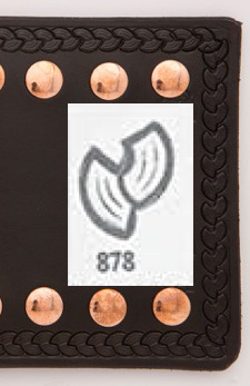
I think it's this one - G878
-
Sorry for your loss.
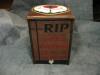
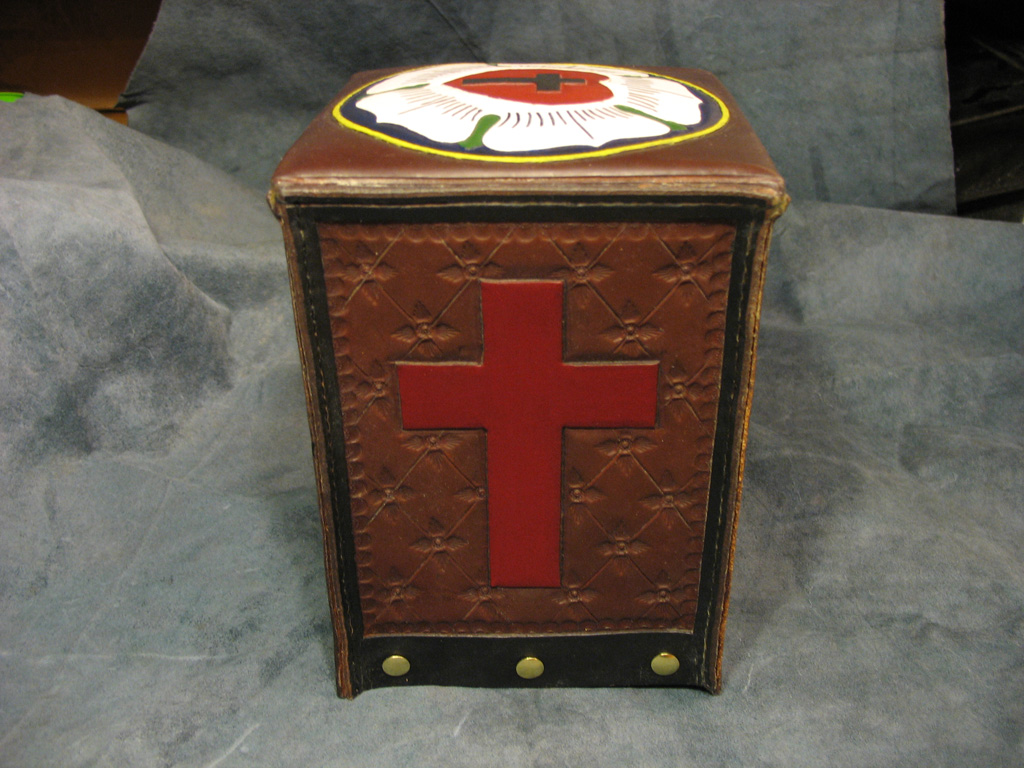
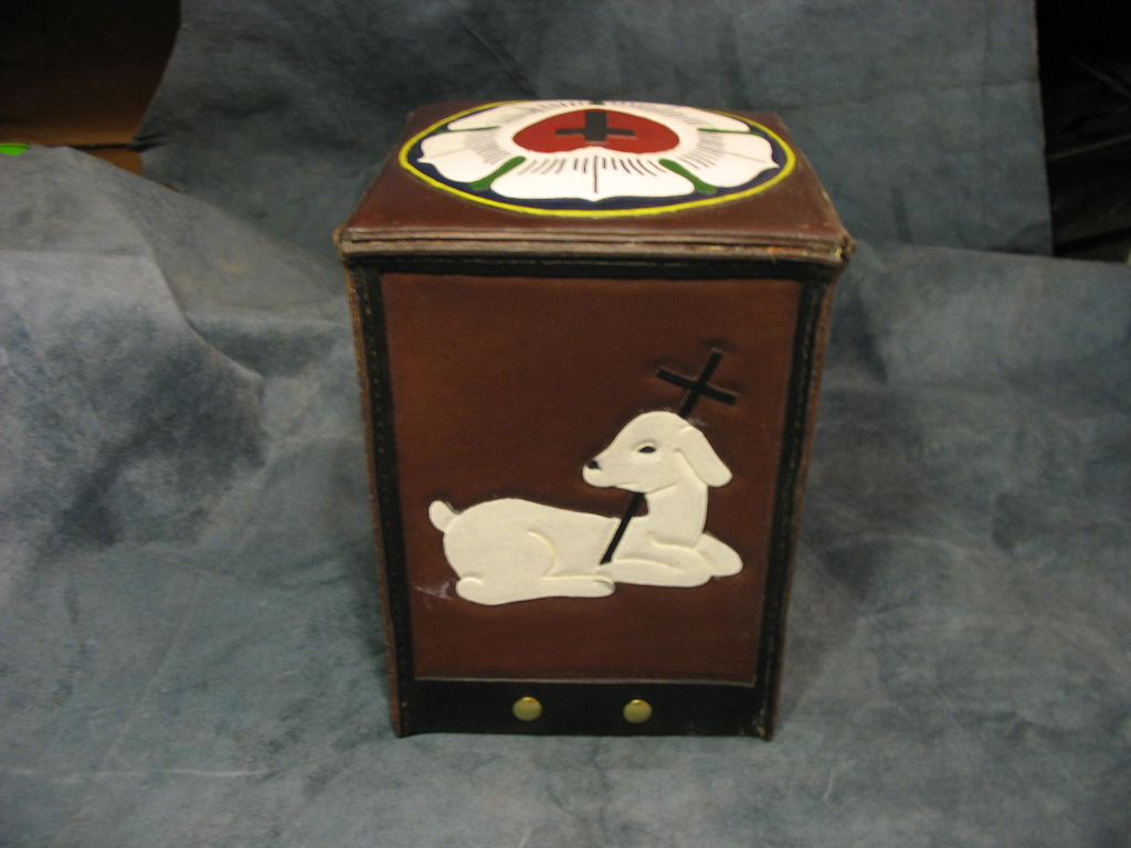
I created this for my wife's ashes. a fairly simple box.It distorted a little when I put it into a pan of hot wax.
Once I'd gotten the excess wax off I used a hair dryer to get the shape back.
It was only on 'display' for the morning before being buried in the graveyard.


-
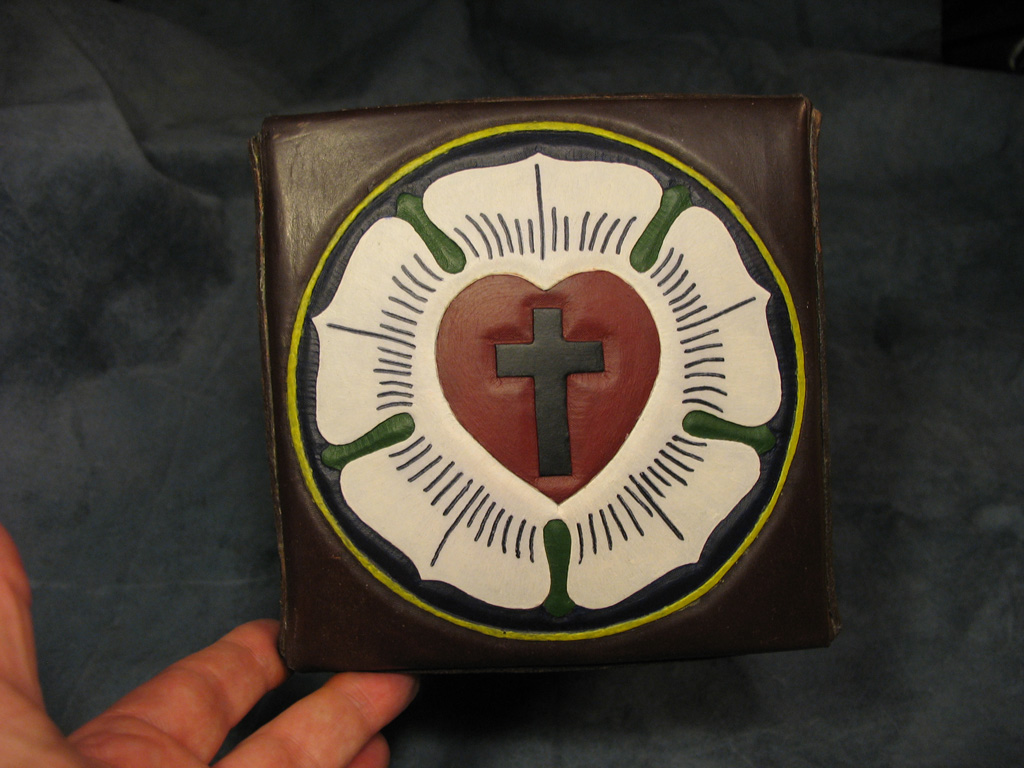
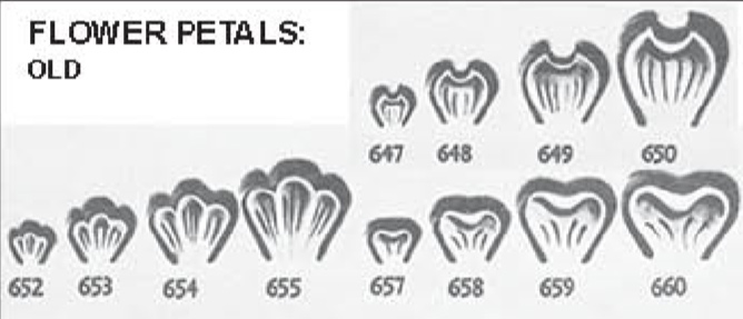
It is close, but the two 'petals' to the side don't stand so close to the centre one on the F990, They poke out the side more.
Must be some-one out there that has one just like it, just a case of waiting until they come along
-
Studio-N was close, I think it's the 652, can't see one on Ebay though

-
-
Awesome work....... as usual

-
I'm IMPRESSED, excellent idea

-
5000 Ruble is the biggest at 157 x 69 mm
According to this....
http://www.cbr.ru/Eng/bank-notes_coins/?Prtid=banknotes_itm&selBanknote=5000r_10&type=type1
if that helps
-
Originally England
Reside in Finland
Currently in Peru -
Excellent sheath João. I'm not a fan of neck sheaths, I hate the idea of having something sharp near my throat. Might be why I have a beard

The way you've retained the knife is clever, I can see that getting used in a few other places. Has a great click too

how are your retaining the knife. just molded tightly? I have never seen one quiet like that.
Watch the video, it shows you really clearly how it's held in

-
-
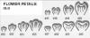
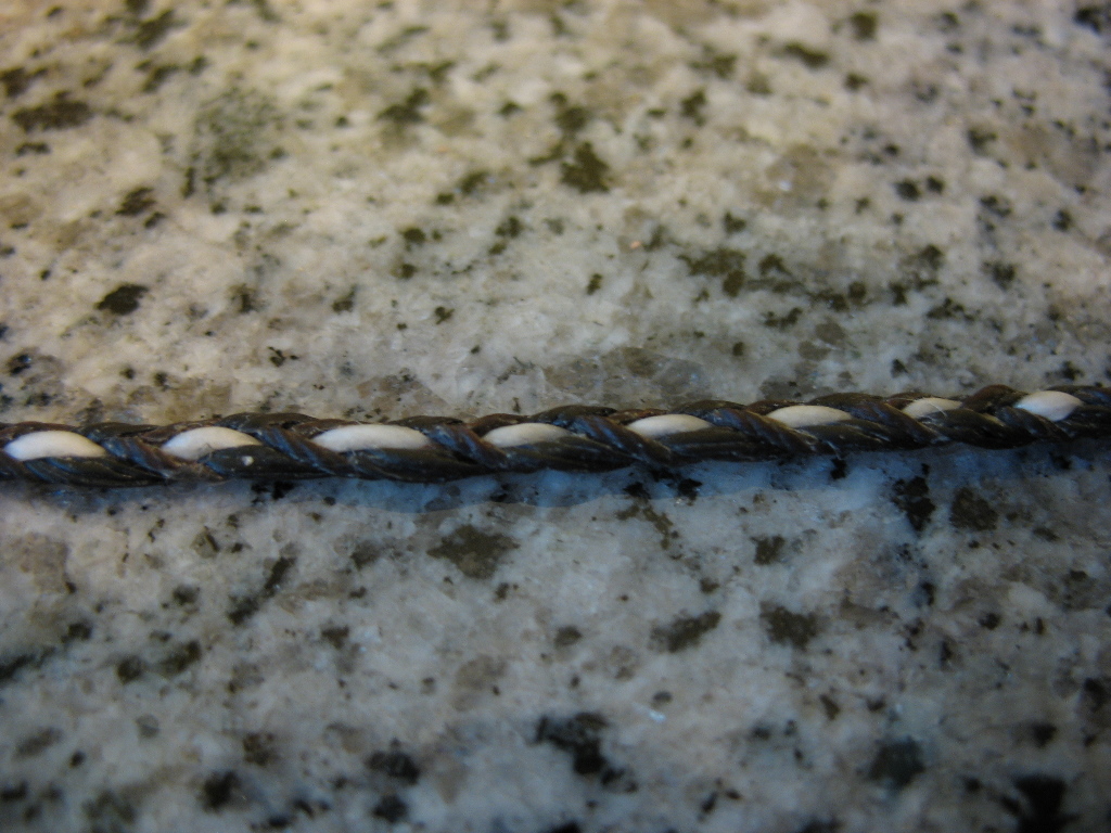
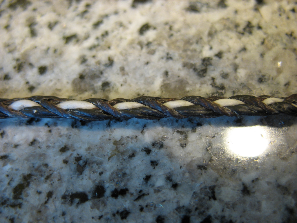
I'm not a braider but I think it's a 5 strand braid, middle (lighter colour) strand just goes up and down as you alternate the other four.
Some of the other braider's can explain it better
I don't have any lace to try it one, so I used some wax thread, it looks close enough to me

-
Getting back to the cover - His number of 'kill's' on the rifle butt is a nice touch

-
What can I say???
Stunning piece of work
Gonna wear this 'you rock' emoticon out.
Here's to panel 2

-
I was a bit thrown off, I expected something totally different color wise! (don't mean that in a bad way or anything)
I agree with ironhead13, it wasn't what I was expecting either.
But you pulled it off, again. It looks great

-
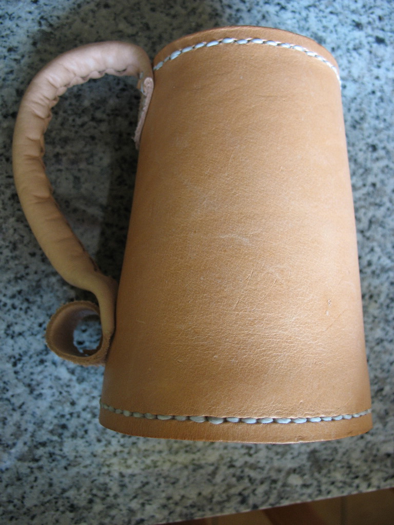
First one and a great job at that. What is the seam you used on the handel? Also I assume the bottom stiching held in the bottom plug. But was the top stitching just for decoration or is it holding something together?
Thanks for that. The seam on the handle (and main body) is an odd one I saw on another forum, I thought it was worth giving it a try on one of these. The main body was, but I don't think I'll do another handle like it.
Your right on the stitching, the bottom row holds the base in, the top row was just balance it out, instead of just having a bare groove around the top, or nothing at all. I thought it would look better, even more so once
it's had the beeswax treatment and darken the leather up.
-
Looking good so far! I'm eager to see how the final product comes out. Oh, just a reminder, if you wax-saturate the leather, it's going to turn really dark brown.
I'm fairly pleased with how it came out. Handle was a little too short so I had to set it higher than I wanted too.
I'm not sure yet if I'll saturate it or just coat the inside, but I've got plans in my head for the next one, so I'll need more than a small block of beeswax.
I'll keep the body as it is, lengthen the handle and change how I constructed it. It seemed a good idea in my head but it doesn't look right, even if it was long enough, it still wouldn't look right.
and I'm getting the pieces together to form the bases similar to your tutorial

-
That's a nice one.
It look's like a bracer.You need one for the other arm now.
And you've got 27 days to do it in

-
The 'search' function at the top of the screen works really well

But, this might help ya
http://leatherworker.net/forum/index.php?showtopic=24009
Good luck with it.
-
I dunno about that. You've been hogging the funny hat to good effect.
I can't help myself

Anyway, back to the Dragon's
To ALL those taking part, and have a little bit of Jedi in them, May the Fourth be with you!

-
No problem, I've often got the wrong hat on


-
"NOT CONSIDERED TOOLS:
COMPUTER
HAMMER
DIVIDERS
STRAIGHT EDGES
STYLUS / PENCIL
PAPERS / PLASTIC SHEETS"
No Hammer? does that mean no mallet or mauls either?
Other way around, that list are the tools you can use that DO NOT count as one of the 5 that you use to get your design on the leather.
For instance my 5 would be-
1 Swivel Knife
2 Beveler Stamp
3 Small Background Stamp
4 Big Background Stamp
5 Mule Foot Stamp
It would be an impossible challenge if you couldn't use a hammer, mallet or maul.
Hope that helped clear it up, now, have fun

-
Any constructive criticism would be welcome. I plan on changing the font used and resizing the text but Id like to keep the 'Old London' font for the menu items.
To get away from the Facebook cr*p...
It's looking good, I'd keep the 'Old London' too.
Something else I considered is to replace the main logo with a picture of a real tooled version of it. Let me know what you think.
And a tooled version of your logo is an excellent idea
-
With the nice weather I've got a lot of other stuff to do, so I'll be DRAGON my feet with the next challenge


site certificate expired?
in Feedback and Suggestions
Posted · Report reply
I have the same issue, so it's not just you.