esantoro Report post Posted January 24, 2008 Again, thanks for all the help. My stamp is already many times better. I really like the idea of having a design underneath Walden Bags. What do you all think about a design that incorporates the capital letters "W" and "B"? This could go either atop "WALDEN" or be incorporated into the design underneath "BAGS." Ed Quote Share this post Link to post Share on other sites
dbarleather Report post Posted January 25, 2008 Ed, Here is the logo with different wording. My opinion is to keep logos as simple as possible.....not too cluttered. Yes, I do laser into leather. I'm currently lasering a maker stamp, but as soon as it finishes, I will laser the attached logo into leather and post it for you. Hope this helps you. Regards, Daryl Quote Share this post Link to post Share on other sites
dbarleather Report post Posted January 25, 2008 Here ya go Ed. 2" oval lasered. Quote Share this post Link to post Share on other sites
Jordan Report post Posted January 25, 2008 That is cool looking, classy. Quote Share this post Link to post Share on other sites
esantoro Report post Posted January 25, 2008 This is awesome, Daryl. Do you also make stamps for impressions? ed Quote Share this post Link to post Share on other sites
esantoro Report post Posted January 27, 2008 I like "Functional Elegance". Or "Elegant Simplicity" or "Simply Elegant" "Superior Elegance" "Built-in Elegance" "Sturdy Elegance" "Practical & Elegant" "Sturdy and Simply Beautiful" Johanna What about "Rugged Elegance"? Ed Quote Share this post Link to post Share on other sites
Johanna Report post Posted January 27, 2008 Yep. Rugged elegance. I like it. Johanna Quote Share this post Link to post Share on other sites
TwinOaks Report post Posted February 1, 2008 Johanna, they're discussing the label for the leather work.....not YOU. Quote Share this post Link to post Share on other sites
esantoro Report post Posted May 29, 2008 (edited) Ed, Thought I'd throw in some input. Let me know if you'd like to see it on leather. Daryl Daryl, What font did you use here for the subtext? Thanks, Ed Edited May 29, 2008 by esantoro Quote Share this post Link to post Share on other sites
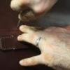
esantoro Report post Posted May 29, 2008 if your going to be punching ovals out of a decent weight leather you better be strong - no double hits if you want clean edges-one whack and you best be through..I'd get the heaviest damn mallet I could find and I'd put a rubber mat on an anvil to do my punching......you want a super solid surface to do your punching... IMSHO, of course steveb Thanks, Steve. I now have the heavy hammer and the perfect anvil. Ed Quote Share this post Link to post Share on other sites
esantoro Report post Posted May 29, 2008 (edited) Thanks for everyone's in helping me brainstorm ideas for a logo. I am now very, very close to finalizing a decision and having Daryl make me a stamp. Here is what I have so far. I may decide to change the subtext font. Which logo do you prefer? Each one has a number inside the oval on the left side. Ed Edited May 29, 2008 by esantoro Quote Share this post Link to post Share on other sites
Jordan Report post Posted May 29, 2008 I vote for #3 Quote Share this post Link to post Share on other sites
Luke Hatley Report post Posted May 30, 2008 ED I'LL VOTE FOR #3 ALSO. Quote Share this post Link to post Share on other sites
Windy Report post Posted May 30, 2008 Thanks for everyone's in helping me brainstorm ideas for a logo. I am now very, very close to finalizing a decision and having Daryl make me a stamp.Here is what I have so far. I may decide to change the subtext font. Which logo do you prefer? Each one has a number inside the oval on the left side. Ed I think you need to rework the word WALDEN. The gap between the w and a makes it look like W ALDEN to me. Of course I also think the name WALDEN needs to be centered with bags under it and your other statement curved around the top.Just my most humble opinion. Quote Share this post Link to post Share on other sites
esantoro Report post Posted May 30, 2008 I think you need to rework the word WALDEN. The gap between the w and a makes it look like W ALDEN to me. Of course I also think the name WALDEN needs to be centered with bags under it and your other statement curved around the top.Just my most humble opinion. That gap between the W and the A was also bugging me. Thanks, everyone, for the feedback. I also like no. 3. , but was thinking that maybe the bold-faced fonts would stamp better. Ed Quote Share this post Link to post Share on other sites
Windy Report post Posted May 30, 2008 This is just a quick example of what I was talking about. WINDY Quote Share this post Link to post Share on other sites
esantoro Report post Posted May 31, 2008 The obsessing is almost nearing an end. I've found out how to change spacing between characters. Which logo version do you like better? Each version has a number from 1 to 4 inside the oval on the left. Thanks, Ed Quote Share this post Link to post Share on other sites
Johanna Report post Posted May 31, 2008 I put all four side by side on the screen. I like #2 the best. Johanna Quote Share this post Link to post Share on other sites
Myriam Report post Posted June 1, 2008 Yup, I'd go with #2 as well. Quote Share this post Link to post Share on other sites
esantoro Report post Posted June 1, 2008 (edited) Thanks, again, for the feedback. Almost there. Here's #2 again along with two new choices. Do you still prefer #2, or one of the others? Thanks, Ed Edited June 1, 2008 by esantoro Quote Share this post Link to post Share on other sites
Johanna Report post Posted June 1, 2008 I like #8 better than #6 (maybe I have a prejudice against the overlap in the "w"?) and I'm thinking #8 looks more crisp than #2. Johanna Quote Share this post Link to post Share on other sites
Myriam Report post Posted June 1, 2008 In terms of the W, I prefer #8 (the one in #6 draws too much attention to itself and you can't really focus on the whole name anymore). And between #2 and #8, well, #8 wins again. The letters look more evenly spaced in it. Quote Share this post Link to post Share on other sites
esantoro Report post Posted June 1, 2008 (edited) In terms of the W, I prefer #8 (the one in #6 draws too much attention to itself and you can't really focus on the whole name anymore). And between #2 and #8, well, #8 wins again. The letters look more evenly spaced in it. Whichever font I choose, I will obsess over the spacing of everything and get it just right. Everyone I've asked on my end hear prefers the English 111 Vivace subtext font, so that has now been decided upon. The only thing left is to decide upon the font for the main text. The font with the overlapping W is Garamond, which I do like and might try to use just that W as a key ring fob or some kind of logo elsewhere, perhaps with an incorporated B. The main text font in #2 is Georgia, which seems to be edging its way toward my second choice. I'm sort of leaning towards ruling out #8, Times New Roman, because I don't particularly like the left half of the W, something thin and asymmetrical about it. Thanks, again, for putting up with my fussiness. It really does help to get others' opinions. Ed P.S. I just now decided to throw #4 (which I think was #3 in an earlier post; I'm beginning to confuse myself with all the revisions and need to put this thing to rest soon) back into the hat. Edited June 2, 2008 by esantoro Quote Share this post Link to post Share on other sites
Jordan Report post Posted June 2, 2008 Ed, the stamp maker should be able to clean up the spacing and such, just go with your gut. I'm sure whichever you choose it will look great. Quote Share this post Link to post Share on other sites
esantoro Report post Posted June 2, 2008 In terms of the W, I prefer #8 (the one in #6 draws too much attention to itself and you can't really focus on the whole name anymore). And between #2 and #8, well, #8 wins again. The letters look more evenly spaced in it. That's a good point about that one W drawing attention to itself. Thanks. Quote Share this post Link to post Share on other sites