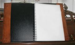
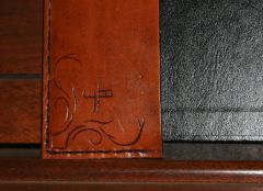
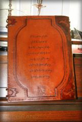
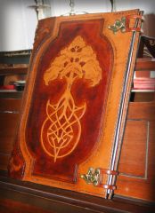
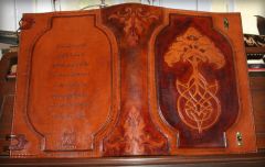
Members Studio Apocalypse Posted January 7, 2010 Report I love the quality and detail of this journal. A few things catch my eye from a design stand point. You have a lot of structure and symmetry going on, which could be pushed a little further. 1. I almost expect to see the same quality and TLC along the sides as you made on the spine. The same dark tones and corner patterns would really frame your center pieces. 2. The back cover seems like it wasn't given the same TLC as the front. Quick idea solution: Make the text appear to be on a scroll, part of a tree, stone, or any number of things that you can imagine. Darken the area around it as done on the front cover and you're done. This would balance your design and play off of the symmetrical elements in the overall layout and the asymmetrical design of the tree on the cover. 3. If you really wanted to go overboard, you could cut and weave the strap closures to resemble the roots of the tree. Looking forward to seeing what else you come up with, good stuff man. Quote


Recommended Comments
Join the conversation
You can post now and register later. If you have an account, sign in now to post with your account.
Note: Your post will require moderator approval before it will be visible.