


ironhead13
-
Posts
131 -
Joined
-
Last visited
Content Type
Profiles
Forums
Events
Blogs
Gallery
Everything posted by ironhead13
-
What the hell is an FHL? Or do they just spell it weird over there lol!
-
I agree! The ARM logo is the most memorable and best one I've seen, I could not tell you what anybody else's looks like. However, I did just read that thread, and disagree with everything those guys said. Other than, the average joe may not know what a head knife is. But the changes some were wanting to see in my opinion were terrible idea's. IMO. Now that I think about it further, you need to focus on the company name and or abbreviation. Come up with a solid logo for the letters. Then fit that in either the sheild, or an axe near it, above, below sideways whatever...,axe with a handle. As I do agree just the axe head and the average firefighters axe head is not a good looking or memorable design without the handle. do yuo get waht Im saiyng. Recognition.
-
Didn't think about doing that to the existing tube. Center punch, run a pilot hole and step it from there. Hardest part will be keeping it straight if doing it with a hand drill, if you got a drill press it would be simple to make a quick jig outta a piece of wood.
-
All you'd have to do is, get a piece of round stock (or close to it and sand it down) the same diameter as the original "blade holder tube", cut it to length and drill out the center for the BK blade. Would be really easy to do with a drill press, even simplier with a lathe! Could probably get it done at a local machine shop cheap, make a few and sell them to others with the same problem. Actually, one end for BK and the other for tandy incase the original tube ends up missing.....
-
With what has already been said #3. With FHL, but find a cleaner font for the FHL initials, it's too broken up and looks sloppy. I also like the first axe head. But to much red lettering. The third axe head has to much back ground in the axe head. Instead on using the same for over again, for the .com portion use a simple arial or similar font. Or, I'd use the axe head for small graphics areas with just the name in it. A more pronounce or over exaggerate axe head would be more memorable. The blue back ground kills them all together in my opinion. More often than not a solid logo, is simple. Think about a billboard as you pass it going down the interstate. Did you have enough time to read it and get the point across? I'd probably loose the tooling designs in them as well, or limit it to one pattern with the leatherish back ground. On a design stand point, be mindfull of your resolution. Alot if not just about everybody makes their graphics for the net. When it comes time to, say, print a t shirt you could have yourself back into a corner, bands are the absolute worse when it comes to this. Always create a "master file". Large resolution, 300dpi and a good inch measurement (say over 10 inches at minimum) and keep that file in layers, you can downsize a copy for your needs from there. An image can always be made smaller without degrading it. But an image cannot be made larger without hurting it. Unless it is vector art, which the above is not. Just different suggestions to "maul" over.
-
The Next Victim! Vintage Tele Wrap And Tool!
ironhead13 replied to chancey77's topic in Musical Instruments
I noticed that. I thought it was a little funny as searching through the site there are other tooled "tots". -
The Next Victim! Vintage Tele Wrap And Tool!
ironhead13 replied to chancey77's topic in Musical Instruments
LOL, then stop tooling them. -
Will Block Or Resist Work With Vinegaroon?
ironhead13 replied to DoubleC's topic in How Do I Do That?
I don't like using the stuff but I keep it around (hate the smell, hate vinegar..). Either way, I have tested using it as a dye in tighter spots and it worked out fine as suggested above. -
Old Ugly Seat Gets A Facelift And New Guts!
ironhead13 replied to chancey77's topic in Motorcycles and Biker Gear
I had to wait and come back to this and re-check that pic out. I need to see that frame with the engine in...not feeling that tank... Seat looks good on it though! That angle really makes the gold stand out, cool idea. -
Old Ugly Seat Gets A Facelift And New Guts!
ironhead13 replied to chancey77's topic in Motorcycles and Biker Gear
Thats whats on mine. Doesn't look like the hardest seat to cover, but that backside should be interesting to do... to say the least! -
Items Stolen From Duane Ballard This Weekend
ironhead13 replied to Cyberthrasher's topic in Leatherwork Conversation
That sucks. I have only ONE use for a thief.... 1 thief + 7.62 x 39 = justice -
Old Ugly Seat Gets A Facelift And New Guts!
ironhead13 replied to chancey77's topic in Motorcycles and Biker Gear
I was a bit thrown off, I expected something totally different color wise! (don't mean that in a bad way or anything) What is this "clear matte gloss leather gloss"? Textile paint? Like the stuff at crafts stores, or plastisol? They do make a graphics ink for screen printing made specificly for leather, though never needed to use it or have it cross my mind for leather work. Makes me kinda wonder what the possible uses could be for leather work though. -
Geat idea, post it up when done. Been trying to think of something do put some of my stuff up on the wall. Coffin sounds like a great idea.
-
enter resting.... got any pics of it used?
-
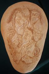 lol, panheads forever! The nun and priest faces were easy. However, the jesus was a bit more challenging (I'd like a redo with the hair), but the devil face was almost impossible and I don't like how it came out. The angle everything about it I just couldn't wrap my mind around what and how to do it right (not that I really knew how to do most of it right to begin with!!!). Oh well,trial and error, practice, practice. When the lace (black) gets here I'll start finishing it up. Getting 3/16th and either round braid or triple loop. Both color suggestions are what I was leaning towards. We'll see, as I start that process theres no telling what will happen. I may be pink when it's said and done.
 -
Great work, how do you get that color?
-
From the album: Thumbs down.. works in progress.
First seat Im working on, about my 10th time carving.... Don't laugh to hard, did what I could! Currently stuck.... have no idea what to do color wise. Don't wanna go full black, don't want to paint. Im thinking either black where needed, then everything red, or brown/close to natural with black antique....... I DON"T KNOW!!! Very open to suggestions, that is if your not to offended.© © leatherworker.net
-
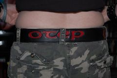 Funny enough, I was listening to otep today while learning how much I hate pear shaders. This must be the black and red belt you spoke of a while back, like it!
 -
From the album: Thumbs down.. works in progress.
© © leatherworker.net
-
Super Sheen Taking Off Dye1
ironhead13 replied to glockanator's topic in Gun Holsters, Rifle Slings and Knife Sheathes
ditto to the two above post. Never have had the pro oil dye come off of anything... nor issues with getting the black that I want. However, it's not oil based... the title is very misleading. -
It's very interesting when one of your riser bolts shear off... and your bars turn one way and your front end goes the other.
- Show previous comments 9 more
-

I'd be more worried about the smell

-
ha
-
ha
-
Just my opinion..... but would find it very negligent to rely on a holster, especially a leather holster, to minipulate the safety to However, one thing I've been interested in is the Spetsnaz holsters for Makarov models. But Im sure they are all plastic/kydex whatever. Probably the best idea for a holster as if removed downward, it not only goes safety off but racks one in the chamber. So you can carry a dead mans gun without it truely being a dead mans gun. But that has nothing to do with this post I suppose.
-
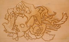
Well this is all Im doing to it. Not perfect by any means. Will be a while before I can go further. Color wise, I think Im just going to look into antique, something dark.. don't know never used the stuff. Either way... I get to do more letters tomorrow... yay....
-
Conchos ,fringe, And White Thread Now Red!
ironhead13 replied to chancey77's topic in Motorcycles and Biker Gear
haven't seen that movie in like 10 years. I know I guy that looks about like that guy, he's got an old rusted up shovel as well. I'll have to get a pic and put it up. FLT, FLH, BLT no idea ... so lets go with FTW. -
Old Ugly Seat Gets A Facelift And New Guts!
ironhead13 replied to chancey77's topic in Motorcycles and Biker Gear
I don't know all I see is a couple lines...