esantoro Posted January 27, 2008 Author Report Posted January 27, 2008 I like "Functional Elegance". Or "Elegant Simplicity" or "Simply Elegant" "Superior Elegance" "Built-in Elegance" "Sturdy Elegance" "Practical & Elegant" "Sturdy and Simply Beautiful" Johanna What about "Rugged Elegance"? Ed Quote http://www.waldenbags.com http://www.waldenbags.etsy.com
Moderator Johanna Posted January 27, 2008 Moderator Report Posted January 27, 2008 Yep. Rugged elegance. I like it. Johanna Quote You cannot depend on your eyes when your imagination is out of focus. - Mark Twain
Contributing Member TwinOaks Posted February 1, 2008 Contributing Member Report Posted February 1, 2008 Johanna, they're discussing the label for the leather work.....not YOU. Quote Mike DeLoach Esse Quam Videri (Be rather than Seem) "Don't learn the tricks of the trade.....Learn the trade." "Teach what you know......Learn what you don't." LEATHER ARTISAN'S DIGITAL GUILD on Facebook.
esantoro Posted May 29, 2008 Author Report Posted May 29, 2008 (edited) Ed, Thought I'd throw in some input. Let me know if you'd like to see it on leather. Daryl Daryl, What font did you use here for the subtext? Thanks, Ed Edited May 29, 2008 by esantoro Quote http://www.waldenbags.com http://www.waldenbags.etsy.com
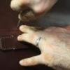
esantoro Posted May 29, 2008 Author Report Posted May 29, 2008 if your going to be punching ovals out of a decent weight leather you better be strong - no double hits if you want clean edges-one whack and you best be through..I'd get the heaviest damn mallet I could find and I'd put a rubber mat on an anvil to do my punching......you want a super solid surface to do your punching... IMSHO, of course steveb Thanks, Steve. I now have the heavy hammer and the perfect anvil. Ed Quote http://www.waldenbags.com http://www.waldenbags.etsy.com
esantoro Posted May 29, 2008 Author Report Posted May 29, 2008 (edited) Thanks for everyone's in helping me brainstorm ideas for a logo. I am now very, very close to finalizing a decision and having Daryl make me a stamp. Here is what I have so far. I may decide to change the subtext font. Which logo do you prefer? Each one has a number inside the oval on the left side. Ed Edited May 29, 2008 by esantoro Quote http://www.waldenbags.com http://www.waldenbags.etsy.com
Contributing Member Jordan Posted May 29, 2008 Contributing Member Report Posted May 29, 2008 I vote for #3 Quote
Ambassador Luke Hatley Posted May 30, 2008 Ambassador Report Posted May 30, 2008 ED I'LL VOTE FOR #3 ALSO. Quote Luke
Members Windy Posted May 30, 2008 Members Report Posted May 30, 2008 Thanks for everyone's in helping me brainstorm ideas for a logo. I am now very, very close to finalizing a decision and having Daryl make me a stamp.Here is what I have so far. I may decide to change the subtext font. Which logo do you prefer? Each one has a number inside the oval on the left side. Ed I think you need to rework the word WALDEN. The gap between the w and a makes it look like W ALDEN to me. Of course I also think the name WALDEN needs to be centered with bags under it and your other statement curved around the top.Just my most humble opinion. Quote To all those who think ..........................
esantoro Posted May 30, 2008 Author Report Posted May 30, 2008 I think you need to rework the word WALDEN. The gap between the w and a makes it look like W ALDEN to me. Of course I also think the name WALDEN needs to be centered with bags under it and your other statement curved around the top.Just my most humble opinion. That gap between the W and the A was also bugging me. Thanks, everyone, for the feedback. I also like no. 3. , but was thinking that maybe the bold-faced fonts would stamp better. Ed Quote http://www.waldenbags.com http://www.waldenbags.etsy.com


Recommended Posts
Join the conversation
You can post now and register later. If you have an account, sign in now to post with your account.
Note: Your post will require moderator approval before it will be visible.