Contributing Member ClayB Posted September 1, 2008 Contributing Member Report Posted September 1, 2008 (edited) I decided to go ahead and finsih up the demo piece I started in Rapid City. I played around with some different dyes and paints. The oaks are done with Eco Flow dyes, the eagle and background with Liquitex acrylic paints. The wild roses are Eco Flow dyes with acrylic white for hightlights. They actually look a bit different than the picture. I just put this in the scanner to see how if it would work. Finally, the elk is a combination of Eco Flows and acrylics. The background behind the floral is spirit dye, med brown. I am fairly happy with how it turned out, kinda wish I would have done it on something usable, like a note book cover. It's been my experience that if you want something to turn out nice, do it on scrap. Edited September 1, 2008 by ClayB Quote
Members jbird Posted September 1, 2008 Members Report Posted September 1, 2008 WOW! thanks Clay for showing. Josh Quote
Members anne newkold Posted September 1, 2008 Members Report Posted September 1, 2008 Great job Clay wish I could see it in person Quote
Members Tina Posted September 1, 2008 Members Report Posted September 1, 2008 Make it in to something usable, it's Gorgeous:-) (If you like tips, I have some) I really like the way you did the shading on the oak leaves, it came out great. I don't know if it is the picture or the dyes but on the photo/scan they look more opac than transparen. Is this just the photo or is it the Eco Flow dyes? We need more posting from you Clay:-) Quote
yaklady Posted September 1, 2008 Report Posted September 1, 2008 I decided to go ahead and finsih up the demo piece I started in Rapid City. I played around with some different dyes and paints. The oaks are done with Eco Flow dyes, the eagle and background with Liquitex acrylic paints. The wild roses are Eco Flow dyes with acrylic white for hightlights. They actually look a bit different than the picture. I just put this in the scanner to see how if it would work. Finally, the elk is a combination of Eco Flows and acrylics. The background behind the floral is spirit dye, med brown. I am fairly happy with how it turned out, kinda wish I would have done it on something usable, like a note book cover. It's been my experience that if you want something to turn out nice, do it on scrap. Clay, there is always something you can do with a masterpiece like this one. For instance, sew it on the front of a book cover. If you have a big enough book, you can leave room on the top for a title or a name, or room around the whole thing for some sort of ingenius border design. The piece is very well done. My favorite part is the coloring on the oak leaves. I wish I could do so well! Kathy Quote
TomSwede Posted September 1, 2008 Report Posted September 1, 2008 That's a fantastique piece! The leaves blow me away and animals is top notch as usual. You're not such a bad experimenter yourself!! Tom Quote
Contributing Member Crystal Posted September 1, 2008 Contributing Member Report Posted September 1, 2008 Very nice, Clay. Thanks for explaining the different types of coloring you used. It's neat to see it all in one piece. Love the oaks. Killer critters. I think Kathy may be onto something - put this into something else if it is too small on it's own. Gotta ditto Tina - you should post more often! Crystal Quote
Ambassador leatheroo Posted September 1, 2008 Ambassador Report Posted September 1, 2008 great piece, love the different shadings on the leaves...so many different types of dyes and paints...lovely Quote
Contributing Member ClayB Posted September 1, 2008 Author Contributing Member Report Posted September 1, 2008 Thanks all of you. I appreciate all your comments, and welcome any tips, hints, whacks on the side of the head etc. that will help me out. Especially with the coloring. It was fun to try some of these different things and some of them I was pretty happy with. The elk could use some help, but it's the first one I was brave enough to try coloring. Coloring oak leaves with the eco flow dyes is really easy. I start out by putting about 6 drops of yellow and green in one of those plastic paint trays with 6 cups to hold paint. Then add about 10 drops of water to each color. For the red, I use the same amount of water as dye. For orange, I use about 3 drops of red, 5 drops of yellow, and then about 10 drops fo water. I also mix some stronger green, about half dye, half water. I start coloring with the more diluted green, going down the center vien, and coloring the bottom portion of the leaf, staying in the areas I pear shaded and away from the tips. As the brush runs out of dye, work it higher on the leaf into areas that will be the next color. Next color on this was yellow. Fill the brush with yellow and go right over all the green, on the tips, and farther up the leaf. Seems like yellow blends everything together. You can even do the whole rest of the leaf with the yellow at this point if you want. Then go on to orange. Usually with the orange, I like to start at the tips of some leaves and work back down to blend into the other colors. Put it on heavier at the tips and scallops and as you start to run out of dye, work it down into the other colors. When the brush is almost dry, I will scrub it into the yellow and even over some of the green. You can barely see it, but it helps to blend the colors together. I use the red very sparingly, usually only of a turn back part of a leaf, or maybe a couple of the scallops between the tips. It's pretty easy to over do it, so I try to make sure there isn't too much on the brush when I start. With the stronger green, I'll go back up the center vein, and a little ways out from that, but dont cover all the original green, giving it another shade. Then when all the colors are on, I go back over everything with yellow again. It just seems to blend it all together, and doesn't seem to take anything away from the other colors. Simple, right???? So come on all of you, give it a try!!!! Tina, I'm not sure if they are really opaque. The aren't really transparent, but they dont cover up the leather like acrylics do, so you can really tell it's leather yet. They remind me of water colors. I think you'd have fun experimenting with them. Again, thanks for all your comments, and if you want to see it in person, you're gonna have to come visit me. Or you can stop at Bert's place, he has the original one, but I only colored the top half of it. Quote
Contributing Member TwinOaks Posted September 1, 2008 Contributing Member Report Posted September 1, 2008 I have to agree with you, Clay, it really is too small to do anything useful with it. However, I just happen to have a half wall that's looking pretty plain and ..... With the amount of usable border on it, I think you've got ample space to lay in some lacing holes and lace it into a larger piece. Add a small welt under the larger piece when you lace it and it'll look like it was inlayed instead of just laced in. Quote
Members CitizenKate Posted September 1, 2008 Members Report Posted September 1, 2008 Lovely work, as always, Clay! Kate Quote
Members lindatt Posted September 1, 2008 Members Report Posted September 1, 2008 Beautiful!! I love the blue around the eagle..... it is intense! btw.. thanks for your generous comments on my guitar cover and bear! they were very uplifting Quote
ArtS Posted September 1, 2008 Report Posted September 1, 2008 That really is beautiful Clay. ArtS Quote
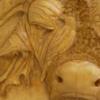
Roger Posted September 1, 2008 Report Posted September 1, 2008 what a beautiful piece clay! i love the mix of "fall" colors on the leaves and the highlights on the acorns to give them more dimention Quote
Members shirleyz Posted September 1, 2008 Members Report Posted September 1, 2008 Beautiful Clay!!! You are the Leaf God! Shirley Quote
Recommended Posts
Join the conversation
You can post now and register later. If you have an account, sign in now to post with your account.
Note: Your post will require moderator approval before it will be visible.