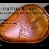
David Posted July 19, 2008 Report Posted July 19, 2008 I had to try the bi color lacing....This seemed like the perfect seat because the design looked a bit like a poker chip or roulette wheel. Feel free to give opinions as always. Dave Quote
Scary Leatherworks Posted July 19, 2008 Report Posted July 19, 2008 nice lettering and lacing. what is that lacing technique called? Quote
David Posted July 19, 2008 Author Report Posted July 19, 2008 The two color lacing is just called double loop bi color. The lacing at the front of the seat is an applique lacing. Dave Quote
Members shirleyz Posted July 19, 2008 Members Report Posted July 19, 2008 Hi David, Nice job on lining up the lettering. I have a hard time with the stamps, always crooked. Yours looks great. Shirley Quote badassseats As long as I have a want, I have a reason for living. Satisfaction is death. ~George Bernard Shaw
David Posted July 19, 2008 Author Report Posted July 19, 2008 Shirley, You wound me to the core, dear, the lettering is cut by hand....I don't even own the stamps. LOL just teasing you girl. Dave Quote
Members SusanC Posted July 19, 2008 Members Report Posted July 19, 2008 Dave, As always I'm in awe of your work. I'm still in the fear stage on my seat, and since the tutorials are gone I have been bummed out. Your seat is outstanding as usual ! SusanC Quote
David Posted July 19, 2008 Author Report Posted July 19, 2008 (edited) Here is the seat all tied down and read to start the final lacing. Dave Edited July 19, 2008 by David Quote
MADMAX22 Posted July 19, 2008 Report Posted July 19, 2008 LOL I wonder where that guy works. Great job that is some amazing work, the lettering is fantastic. Quote
Contributing Member rdb Posted July 19, 2008 Contributing Member Report Posted July 19, 2008 I come from a seashore town in Ma., and I worked on the water many years, so of course, I always loved the Compass Rose. Nicely done. The two tone lace is always a show stopper. Quote Web page Facebook
Roger Posted July 20, 2008 Report Posted July 20, 2008 david... i don't envy you in the least with that thing! too much lettering for me for sure. you have done a great job of keeping it consistant for sure. the two tone lace is a nice touch Quote

Recommended Posts
Join the conversation
You can post now and register later. If you have an account, sign in now to post with your account.
Note: Your post will require moderator approval before it will be visible.