


sodapop
-
Content Count
344 -
Joined
-
Last visited
Posts posted by sodapop
-
-
a round braid will do the trick for the edge...like many do on the bike seats...
darryl

-
that is simply fantastic shirley!!...its got class & style plastered all over it

darryl
-
well she had dads wallet yet n a checkbook cover which I guess they didnt have the heart to tell me it just didnt fit the checks.thats funny bronco!!...cuz that'd be exactly what my folks would of done
 ...sure does look like it was made yesterday!!
good stuff & thanks for sharin it...
darryl
-
glad ya diggit leatherhead!!...hopefully it'll get the same positive feedback wearin it around & generate some business ;0)
the good words are no doubt appreciated Excell!!...to answer your question, no i don't feel any of the hardware thats visable or under the padding & lining...especially with the padding, the eyelets counter sink into the liner etc...so that keeps them from directly touching/rubbing the skin...all in all it just feel smoooooth wearing it

darryl
-
many many thanks tashabear!!
darryl
-
much'o thanks andy!!...the contrast texturing was one of those things i just kinda fell into during the process and simply rolled with it ;0)
glad it gets your stamp of approval mr. tommy boy!!...ya know i didn't think of the water thingy but now that you mention it...i know exactly what you mean by it...how a thin wash of water will react on glass sometimes...the burst worked out well for this...hard to decide at first how much light to dark fade to do...and at first i thought
 its too dark of a transition but now that its done...i'm happy with it and seems balanced in that way...
i can see pros & cons to lining/padding these...so prolly make them both ways...
no worries brudda tom & i'll catch a few of those toothy gators for ya real soon

darryl
-
can you lay the bracer flat and photo it from above so i can see the contour of the edges....i am curious in the pattern layout.....i like seeing all these diffrent bracers....I been making straight lined ones and trying to understand the patterns used by people....It takes me a while to process stuff like that....anyways it would be nice to see..heres the pic of the back where ya can get the gist of the contour...
 Cool bracer bro. Love how this came out. The lining is an added plus.
thanks for the good words spider!!...hope all is swell with ya spider-man
darryl
-
Darryl,Love the bracer. If I may ask, what tool did you use for the matting/background around the design. I really like that texture.
Thanks
-Aaron
thanks for the compliment aaron!!...that backgrounder is the E294 series...
darryl
-
can you lay the bracer flat and photo it from above so i can see the contour of the edges....i am curious in the pattern layout.....i like seeing all these diffrent bracers....I been making straight lined ones and trying to understand the patterns used by people....It takes me a while to process stuff like that....anyways it would be nice to see..no problem, i'll take a pic tomorrow sometime & post it for ya...
darryl
-
appreciate it kate!!...ya tommy's were the first i had ever seen of the type when i first joined LW...plus hes become a good friend via LW as well from across the pond...so i figured for my first go at one it would be fitting to make it a little tom swede'ish

darryl
-
try contacting robert beard possibly...heres his web page but he doesn't have pics of all his stamps on the site...
http://robertbeardtools.com/Basketweaves,Borders.html
darryl
-
thanks much Roo & Sasquatch!!...its machine stitched...heres the lined/padded backside using 2/3oz cow...

darryl
-
i figured i'd join the bracer club and finally make one...the background has obviously tommy's influence of course...then i modified a regular cuff patten to make this 2.5" bracer...this prototype i made for myself to wear...its fully lined and padded...i just laced it the way it is for the pic to hold it the way i wanted...i don't have any round lace at the moment & the boot lace had to do for now...
darryl
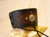
p.s thanks brudda tom for you inspirations & influences you've given many...
-
well that certainly is a quite the purdie burdie bob!!...love the flow of it all
especially how you curled the feathers like ferns into the main body and over lapped some in places...i can see that a project like that would = no coffee for me that day 
darryl
-
that will certainly be an "eye catcher" piece ;0)...i gotta agree with tina tommy boy, kinda like spiders stuff...i could pick who done it a mile away!!
darryl
-
those are dandy's indeedy bob!!...whom ever will no doubt appreciate being awarded any of those fine pieces...
darryl
-
now if she can catch a fish besides...thats a platinum girl right there
 ...and if she has a cute single sister with the same attributes...send me a pm...i'm willing to relocate
 happy birthday budd

-
good show brudda tom!!

darryl
-
heya josh...i believe sheathes is correctly spelled "sheaths" without the "e"...like month as a plural, its spelled months not monthes...if my english is correct the word "sheathes" is an action...example; the deer hunter sheathes his knife after gutting the deer...
an idea also is maybe to take a clean picture of your real maker stamp in leather and crop it then paste it on your card instead of the line drawing...also i'm not really crazy about the font, especially using it for your company title...i don't have a suggestion without looking at others right of hand...but just not the one i'd pick myself...i think the font/lettering makes a statement...and that one honestly doesn't give me the "professional" first impression...but thats just my opinion ;0)...then finally if you go with that exact layout i'd center your number under your name...okay thats it & my 2 cents bud lol
darryl
-
this aircompressor below is a good choice...and don't believe you'll find it for less $$$$ anywhere else...i know a couple of us have this unit...except i bought mine from a specific airbrush supplier and paid about 50 bucks more
 ...you'll be good to go with this one ;0)
http://www.northerntool.com/webapp/wcs/sto...54872_200354872
darryl
-
Well, this sure won't win any prizes, but it's for me personally anyways.Ooops . . . it's out there somewhere (probably in the Delta Quadrant. Oh, well . . . )
your mistaken harvey...it sure does win a prize!!...for the funniest post i've read all day, seriously
darryl
-
Pachydermos
in Art
disturbingly cool
...reminds me of the movie "rise of the reeker"...darryl
-
well chill out josh & have a couple of those or 10 ;0)----->
darryl
-


straight stool seat...please help
in How Do I Do That?
Posted · Edited by sodapop · Report reply
the chisel spacing will be the same as your lace width as well as from the edge of each piece...the edges of leather side and top should match up square...punch your holes in both and what i do is use bread bag twist ties...match up your holes and use a twist tie every 10-12 holes or less pending to keep your two pieces and holes lined up & braid away...
darryl