AlZilla Posted May 31, 2023 Report Posted May 31, 2023 (edited) 1 hour ago, chuck123wapati said: yea I think i posted this. Yep, that's what I saw. If you figure out a formula, I'm all ears. I really like the ropes top and bottom of the right hand side on the bottom piece, too. Can't do that one, either. Edited May 31, 2023 by AlZilla Quote “Those who can make you believe absurdities can make you commit atrocities.” - Voltaire “Republics decline into democracies and democracies degenerate into despotisms.” - Aristotle
CFM Frodo Posted June 1, 2023 CFM Report Posted June 1, 2023 This is what interests me, How did you achieve that 3-D look? Quote Singer 66, Chi Chi Patcher, Rex 26-188, singer 29k62 , 2-needles D.C.F.M
CFM chuck123wapati Posted June 1, 2023 CFM Report Posted June 1, 2023 4 hours ago, Frodo said: This is what interests me, How did you achieve that 3-D look? its how you use the beveler, just at the point where the two camo stamp impressions come together at the vee, on this you can see i used a cross hatch beveler to make the impression Quote Worked in a prison for 30 years if I aint shiny every time I comment its no big deal, I just don't wave pompoms. “I won’t be wronged, I won’t be insulted, and I won’t be laid a hand on. I don’t do these things to other people, and I require the same from them.” THE DUKE!
CFM Frodo Posted June 2, 2023 CFM Report Posted June 2, 2023 14 hours ago, chuck123wapati said: its how you use the beveler, just at the point where the two camo stamp impressions come together at the vee, on this you can see i used a cross hatch beveler to make the impression Dang Chuck, I M looking at what you did and am thinking it is straight forward. Then I make mine look like piggy poo lol I have a huge amount of practice ahead of me here are a couple of designs using 2968 and 0830 and a z/s349 in the flower center Quote Singer 66, Chi Chi Patcher, Rex 26-188, singer 29k62 , 2-needles D.C.F.M
CFM chuck123wapati Posted June 2, 2023 CFM Report Posted June 2, 2023 1 hour ago, Frodo said: Dang Chuck, I M looking at what you did and am thinking it is straight forward. Then I make mine look like piggy poo lol I have a huge amount of practice ahead of me here are a couple of designs using 2968 and 0830 and a z/s349 in the flower center i like those that one on the bottom would make a nice border. i need more stamps or more time or something lol. Quote Worked in a prison for 30 years if I aint shiny every time I comment its no big deal, I just don't wave pompoms. “I won’t be wronged, I won’t be insulted, and I won’t be laid a hand on. I don’t do these things to other people, and I require the same from them.” THE DUKE!
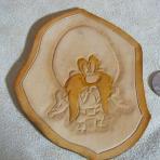
CFM Frodo Posted July 22, 2023 CFM Report Posted July 22, 2023 I found an interesting stamp today while I was f—- up lol. Quote Singer 66, Chi Chi Patcher, Rex 26-188, singer 29k62 , 2-needles D.C.F.M
AlZilla Posted July 22, 2023 Report Posted July 22, 2023 19 minutes ago, Frodo said: I found an interesting stamp today while I was f—- up lol. You must have been something because that impression doesn't look at all like the stamp. The stamp looks more open than the cross bars in the impression. Quote “Those who can make you believe absurdities can make you commit atrocities.” - Voltaire “Republics decline into democracies and democracies degenerate into despotisms.” - Aristotle
Members YinTx Posted July 22, 2023 Members Report Posted July 22, 2023 56 minutes ago, AlZilla said: You must have been something because that impression doesn't look at all like the stamp. The stamp looks more open than the cross bars in the impression. two impressions, rotated stamp. Quote YinTx https://www.instagram.com/lanasia_2017/ https://www.youtube.com/playlist?list=PLK6HvLWuZTzjt3MbR0Yhcj_WIQIvchezo
CFM Frodo Posted July 22, 2023 CFM Report Posted July 22, 2023 1 hour ago, AlZilla said: You must have been something because that impression doesn't look at all like the stamp. The stamp looks more open than the cross bars in the impression. you see it now? Same stamp rotated Quote Singer 66, Chi Chi Patcher, Rex 26-188, singer 29k62 , 2-needles D.C.F.M
CFM Frodo Posted July 22, 2023 CFM Report Posted July 22, 2023 Same stamp rotated 3 times see the point in the center? Quote Singer 66, Chi Chi Patcher, Rex 26-188, singer 29k62 , 2-needles D.C.F.M


Recommended Posts
Join the conversation
You can post now and register later. If you have an account, sign in now to post with your account.
Note: Your post will require moderator approval before it will be visible.