Members DoubleC Posted February 22, 2012 Author Members Report Posted February 22, 2012 Ok... if this is a "double sided brochure," you'll need to do some serious moving around of things. For instance if this is the outside of the brochure, the left panel will fold to the inside and the middle and right panels are the outsides. So... Outside Right panel: Big Logo image, almost filling up the entire space. (crop and edit as needed to make it fit) Western Style Font with DCCC (spelled out). Rope border image? Middle panel: Information... address, phone, Slogan, web address, etc. One photo of eye of the horse (use a frame) and shadow. (use Sienna's eye here) Left panel: Image (1) of one product and brief description. Inside: Right panel: Photo of Tack. and part of the content you currently have on the left panel, edited as suggested earlier Middle: "eye of the horse" Blue photo here Continue with part of the content , edited. Left. Rhythm beads, more of the content. End this page with your coupon so it's easy to cut out and use. Remember these photos are going to be in black and white unless you pay for color printing. So they need to be edited so they are nice and clear, white background, etc. While you are editing.....that one photo with the Tack.... please do what you can to obscure or cut out that Soda Cup and crop it down so it is more about the tack rather than your wall. Funny you said that about right-brained folks. When I was tested they found I use both sides of my brain equally. It DOES look like a pop can doesn't it? Actually it's a yogurt container with brushes in it. That's the 'shelves' we made by taking out a door that went to drywall, LOL. I realized it was supplies and never noticed it again. I didn't see anything wrong with people knowing I had SOME supplies, LOL. but now it looks funny. so edit it will. I had planned to print these myself so I never thought about the black and white. Plus the red rose is gonna look macabre in my logo, LOL. But the first ones can be color because George and I will do them. Now I know why my printer kept printing out another page, LOL. And also if i wanted to do double sided printing. I DON'T like management. AND to make it worse I'm working on a 12 ton pile of paperwork for BROC when he and I meet AND He wants me to bring my laptop Friday so we can get my finances under control. I think my spending is about to be curtailed, which is good I know, but not as fun, LOL. Oh jeeze i just realized i need to find Allen, gonna copy and paste this to work on. Thanks so much Syl. c Quote http://www.etsy.com/shop/DoubleCCowgirl
stelmackr Posted February 22, 2012 Report Posted February 22, 2012 OK new one since you hated the last one. Seriously, I hope this is better I read thought the suggestions you have been given and the only thing that I wondered about was the statement about the registed trademark . I did a quick search of the trademark government database and didn't find it. If it isn't a trademark, don't pretend it is. If it is a trademerk, all you need is a little "TM" or circled "R" as the case applies. The long sentence about the trademark takes away from brochere. Otherwise, like all brocheres, they get better over time and through editing. Looking forward to the next version. Bob Stelmack www.pslac.org Quote Bob Stelmack Desert Leathercraft LLC Former Editor of the, RawHide Gazette, for the Puget Sound Leather Artisans Co-Op, 25 years of doing it was enough...
Members Cyberthrasher Posted February 22, 2012 Members Report Posted February 22, 2012 (edited) Sylvia's covering most of the points I was going to make, and Bob pointed out my other suggestion about the trademark. There seems to be a common myth that if you state something like that, that means it's yours (lots of other trademark/copyright myths along those lines too). Now, the business card. I think you're trying to cover WAY too much information in one spot (this could be a lot of your issues with the pamphlet too). Remember, anybody who takes your card is likely already familiar with what it is you do. I think you can clean that up a lot by dropping the description, dropping the facebook information (this is easily added to your website) and just leaving it at basic contact information. Logo/business name needs to be prominent Follow that with name and position contact information isn't usually that large - think footnotes. This should only include phone, email, and web URL. If you have digital copies handy of your logos and everything, I would be happy to help you some other design options when I get some free time. if any of this doesn't make sense - blame the dentist Oh yeah, and I'm not going to vote because none of the options fit yet. We'll get you there though. Edited February 22, 2012 by Cyberthrasher Quote hellhoundkustoms.wordpress.com www.facebook.com/hellhoundkustoms www.etsy.com/shop/HellhoundKustoms
Mike516 Posted February 23, 2012 Report Posted February 23, 2012 Well, I don't usually use either side of my brain, but I think your pamphlet is pretty cool. There's a lot of people who make a lot of money designing pamphlets and such, and I think you did a darn good job. The only thing I'd say is, good punctuation will make it look more professional. Quote
Members SewVic Posted February 23, 2012 Members Report Posted February 23, 2012 Sylvia offered great ideas. I did want to add that I would pretty up the business card...you are offering up your talent as a creative person, yet the card isn't reflecting that. Quote
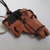
Ambassador pete Posted February 23, 2012 Ambassador Report Posted February 23, 2012 you might add a few well done/close up fotos of some really fine examples of your work and products. I have been following this and pretending that I just "stopped by" this forum, and haven't seen anything that I felt is "up to par" with what I can buy at a feed store or local tack shop. I know that you are working on your craft as I have been monitoring your horse eye project, but you need to spend a lot more time developing your leather talents - get to be REALLY good at what you want to sell and it will sell itself. Maybe do a few pieces with carving and antique work and submit it here for critique. I haven't seen anything yet that shows your capabilities and talent. I sell a fair amount of binders, albums, and wallets and belts a month an still am not happy with my work when I REALLY look at it! NOT trying to be critical- I just haven't seen anything yet from you. pete Quote
Members Bluesman Posted February 23, 2012 Members Report Posted February 23, 2012 if you have not applied for or received thw Trademark for " Eye of the Horse", don't state it. The actual carving can only be claimed as a Trademark if submitted. The name has to be submitted on a separate form. Don't open yourself up for potential liabilities. As for the brochure, keep it simple and to the point. Here is what I do and here is how to get it. Quote If it ain't moving and should......WD40, If it's moving and shouldn't....Duct Tape. There you have it, now fix something
Members DoubleC Posted February 23, 2012 Author Members Report Posted February 23, 2012 I read thought the suggestions you have been given and the only thing that I wondered about was the statement about the registed trademark ™. I did a quick search of the trademark government database and didn't find it. If it isn't a trademark, don't pretend it is. If it is a trademerk, all you need is a little "TM" or circled "R" as the case applies. The long sentence about the trademark takes away from brochere. Otherwise, like all brocheres, they get better over time and through editing. Looking forward to the next version. Bob Stelmack www.pslac.org Thanks Bob, will be working on it today if i can stay awake. Syl's given me some great ideasand the mind's willing but the body catching up on sleep. I do intend to register it so have it in the brochure. Cheryl Quote http://www.etsy.com/shop/DoubleCCowgirl
Members DoubleC Posted February 23, 2012 Author Members Report Posted February 23, 2012 Sylvia's covering most of the points I was going to make, and Bob pointed out my other suggestion about the trademark. There seems to be a common myth that if you state something like that, that means it's yours (lots of other trademark/copyright myths along those lines too). Now, the business card. I think you're trying to cover WAY too much information in one spot (this could be a lot of your issues with the pamphlet too). Remember, anybody who takes your card is likely already familiar with what it is you do. I think you can clean that up a lot by dropping the description, dropping the facebook information (this is easily added to your website) and just leaving it at basic contact information. Logo/business name needs to be prominent Follow that with name and position contact information isn't usually that large - think footnotes. This should only include phone, email, and web URL. If you have digital copies handy of your logos and everything, I would be happy to help you some other design options when I get some free time. if any of this doesn't make sense - blame the dentist Oh yeah, and I'm not going to vote because none of the options fit yet. We'll get you there though. You guys are such a big help ALWAYS. I just want to say thanks right now. And I used publisher for my card and it did the font. I could have changed it, LOL, don't mean that, but it was already laid out so I just filled in the blanks. I have my logo attached, so will let you use your creative vision Allen, while I work on the brochure. But NOT until you feel better. Cheryl Well, I don't usually use either side of my brain, but I think your pamphlet is pretty cool. There's a lot of people who make a lot of money designing pamphlets and such, and I think you did a darn good job. The only thing I'd say is, good punctuation will make it look more professional. Thank you Mike, an oasis in the desert, LOL. Cheryl Quote http://www.etsy.com/shop/DoubleCCowgirl
Members DoubleC Posted February 23, 2012 Author Members Report Posted February 23, 2012 Sylvia offered great ideas. I did want to add that I would pretty up the business card...you are offering up your talent as a creative person, yet the card isn't reflecting that. There's a point i wouldn't have thought of. Getting added to my sheet with idea about FB and punctuation. Quote http://www.etsy.com/shop/DoubleCCowgirl


Recommended Posts
Join the conversation
You can post now and register later. If you have an account, sign in now to post with your account.
Note: Your post will require moderator approval before it will be visible.