

Cyberthrasher
-
Posts
2,397 -
Joined
-
Last visited
Content Type
Profiles
Forums
Events
Blogs
Gallery
Store
Everything posted by Cyberthrasher
-
Definitely agree on that one. Plus, they're a lot more comfortable to hold in my hand compared to the other Tandy tools I have. the SLC tools I bought are more like a Sharpie in thickness compared to Tandy's little pencil.
-
Chancey on a Kawi?????? That don't seem right. My favorite combo ride is a shovester drag bike my friend was fine tuning before he passed last year. One of these days we need to get back to work on that thing and take it out to the strips. Funny thing is, that one's actually licensed as a kawi because of the frame This was a video taken shortly after the first startup of it.
-
WOOHOO!!!! Now, let's see the bike that was the inspiration for it
-

Triangle Bag Rear Left Side
Cyberthrasher replied to chancey77's topic in Motorcycles and Biker Gear
Dude, you're destroying all my excuses for not getting started on my solo bag yet!! Now all you gotta do is come up with the artwork for me I say we get this pinned since it has good patterns with measurements. -
May 2012 Challenge
Cyberthrasher replied to chancey77's topic in Special Events, Contests and Classes
Well, we're glad to have you back I just started this year myself, so all those struggles are pretty fresh in my head (ok, they still exist). -
May 2012 Challenge
Cyberthrasher replied to chancey77's topic in Special Events, Contests and Classes
it's still great, so I really don't want to take away from the job you did by giving more advice , but I have to since that's how we all get better and succeed. It looks like you may also need to work on your casing, and probably sharpen up the knife quite a bit. Beveling takes A LOT of practice to really get it clean looking. I struggled with it for a really long time. If your knife is anything like my beginner one was/is, all it's doing is compressing the leather and not actually cutting it. Mine came with a completely rounded edge and I used it like that for a little while stupidly thinking that that's how it was supposed to be because there's no way they'd send a knife that was supposed to be sharpened with a visibly round edge on it. -
May 2012 Challenge
Cyberthrasher replied to chancey77's topic in Special Events, Contests and Classes
What tools did you use on it? -
I voted for #3, but I think it needs the full "FHL" from the 2nd one instead of just FH. Since your name is Firehouse Leather, having the FH alone feels like it's missing something. Basically, I think the white lettering for "Craig Ferguson...." works better because it helps draw the eye and it just looks cleaner. When I first opened this up, before opening the pictures, my eye was immediately drawn to that thumbnail. The first and last just have too much going on. They're cool, but I just don't think they do you justice. Plus, it seems obvious when you stop and think about it, but some people might not associate the ax with a fireman's tool immediately. 2 and 3 have a fairly recognizable design and it would be a LOT easier to work into a maker's stamp down the road. The more I think about it though, the lettering minus the ax on the 4th one could be a cool header for a web page. I've been thinking about this stuff a lot lately since I'm in the process of designing my own, and unfortunately you actually used all of the fonts I was considering
-
May 2012 Challenge
Cyberthrasher replied to chancey77's topic in Special Events, Contests and Classes
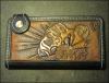
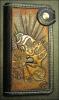
Ok, here's my entry with the tooling all done. The whole project has a way to go still, so that will be a while before it gets posted. Swivel knife, swivel beveler, PA003 pebbler on the shield. In full disclosure - I started to use the B107 beveler at first in the shield, but decided I hated the look of it with the checkered marks after about an inch, so I went with the swivel beveler instead. If you're not sure, do it somewhere that gets a backgrounder anyway so you can cover it up And yes, I know I need a better light source in my basement.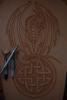
-
May 2012 Challenge
Cyberthrasher replied to chancey77's topic in Special Events, Contests and Classes
Best of both worlds in that one!! Throw artistry in there and you're looking for trouble. I decided the other night that I need to get the keen edge guide when I realized how jacked up the angles are on my "deluxe" blade. I just need to sit down with a guide and get it honed out the right way. -
Items Stolen From Duane Ballard This Weekend
Cyberthrasher replied to Cyberthrasher's topic in Leatherwork Conversation
There's a lead out there somewhere - just have to find it. Were you able to find anything about that wallet on Ebay? I spent a couple hours looking through different searches and couldn't see anything. -
May 2012 Challenge
Cyberthrasher replied to chancey77's topic in Special Events, Contests and Classes
I've already got like 3 hours into mine and I haven't even started tooling the actual dragon yet -
maybe it's just the heavier leather or the looseness of the roll (8" or so diameter roll), but I don't have a single wrinkle in mine and that's how it came to me.
-
Items Stolen From Duane Ballard This Weekend
Cyberthrasher replied to Cyberthrasher's topic in Leatherwork Conversation
yeah, there are lots of Duane's friends spreading the word all over the web and California/US - I'm just doing my part here. I highly doubt they'll get away with it. If they were smart they'd box it up and send it all back no questions asked, but I doubt that will happen. Someone said they thought they saw the wallet on ebay, but we haven't been able to find it yet. -
Updated inventory of stolen items. Everybody please look just in case you may see something in your area.
-
Some people said to cover it with a sheet or something as well to keep the dust off and the light out. I haven't seen any real need to with keeping it the way I do. I've gotten so much mileage out of the "scrap" pieces that I just now started cutting into that last side I bought.
-
Items Stolen From Duane Ballard This Weekend
Cyberthrasher replied to Cyberthrasher's topic in Leatherwork Conversation
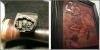
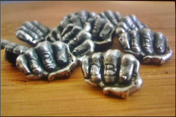
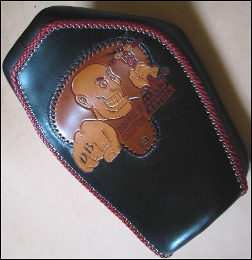
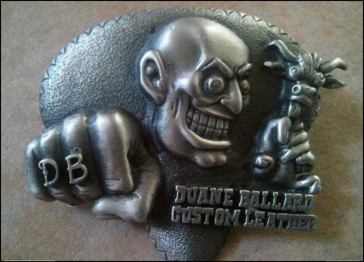
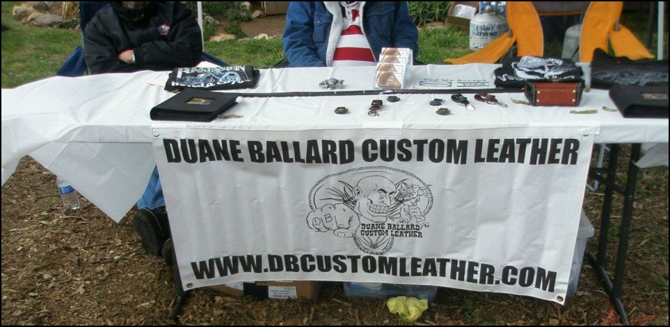
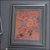
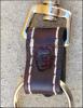
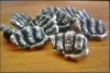
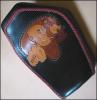
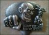
More updates from Duane Ballard: "These are some of the items that were taken out of our truck Friday night in Salinas Ca. I just made over 30 custom key chains and they have my fist on the front of them. We didn't take photos of them as I finished them up on Thursday night. The Rat Fink / Circle Jerk panel and our new t-shirts were also stolen. Any help would be appreciated" Custom Purse was taken as well Missing: Rat Fink/ Circle Jerk wall panel Missing: Custom leather tooled belt with the words Hippy Killer Garage The key chains are longer than this one but are all hand sewn with brass hardware and the DB stamp or DB concho Example of DB conchos Missing: case of new shirts Missing: Custom seat ( used this in our booth for reference ) Missing: Custom Pewter DB Belt Buckles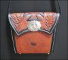


-
From your description, and my own struggles, it sounds a lot like a combination between improper "swiveling" and possibly a blade that needs stropped. I find it helps to adjust the front to back angle of the knife to a more vertical position (relative to the normal angle) when doing tight turns, which allows the swivel to have more of an effect on radius of the turn. I still have a lot of problems with it but I am getting better by using these methods. Another thing you may notice is that if you press into the leather real hard you'll get little raised ridges around your cut line which could also appear like little tears.
-
Will Block Or Resist Work With Vinegaroon?
Cyberthrasher replied to DoubleC's topic in How Do I Do That?
You could try to apply it with a brush or something starting from center and let it wick out to the edges of the eye. Just take it slow and easy and see what happens. I have no experience with it but it sounds like a good idea to me. -
I leave mine rolled up in a box, tooling side in. That will keep it from getting scuffed up and keep it out of the light so there's no other tanning happening to it. I keep all my leather, scraps and all, in a large tote. I did the same research before I started ordering large pieces and came up with mixed answers. But, most did say to keep it out of the sunlight and at least try to cover it up. Just remember how easily the tooling side can get marked up and take the proper precautions and you'll be fine, especially if you expect to use it all up pretty quick.
-
All good advice. The only thing I can add that I do, which seems to help the leery buyer, is give a range estimate upfront. The size of the range will vary based on the item, but at least then they know up front how much they could expect. So, taking a Kindle cover for example. I told my wife that when people ask about it she should tell them it would be between $300 and $400 for a similar style, but a simple sleeve the same size would probably only run them between $250 and $350 depending on the artwork and coloring requirements. My "base" rate is about $20 p/h right now because I'm still pretty new to it and I feel I'm pretty far from perfection. But, I'll also adjust as needed, so the ranged estimate gives me about 5 hours to play with just in case I get really hung up on something. As I speed up and get a lot of the physical design stuff all figured out then I could still charge the same total price, but basically give myself a raise. All the more motivation to put out better work quicker and quicker. So, using the kindle cover as an example, there's plenty of room for all the odds and ends that we don't usually add up when pricing work. Estimated amounts since I did it for my wife. 1 sq/ft of 8/9 oz = $6 1 sq/ft of 1/2 oz liner = $3? Dye = $1 (if that) 5 yd 1/8 lace = $5 Total material - $15 The total time was around 20 hours or so. That leaves me lots of room to work on my speed to build a better profit while still charging similar prices to what other people charge.
-
Items Stolen From Duane Ballard This Weekend
Cyberthrasher replied to Cyberthrasher's topic in Leatherwork Conversation
Some updates from Lisa Ballard "I just found this photo on Lady Hump. This is some of the items stolen, custom purse , laying down, black hand tooled belt with the words "Hippy Killer Garage" on it and a lot of custom key chains. everything has the DB stamp on it"

-
Old Ugly Seat Gets A Facelift And New Guts!
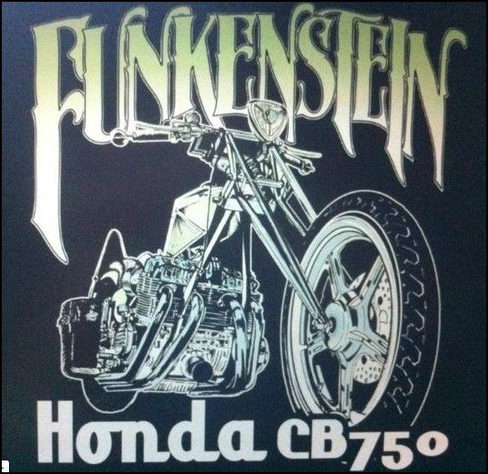
Cyberthrasher replied to chancey77's topic in Motorcycles and Biker Gear
yeah, I didn't completely think it out before I cut the leather, so it might look a little off with the p-pad portion. But, we'll see how it goes. -
Items stollen from Duane and Lisa Ballard. Please keep an eye out for the items shown here
-
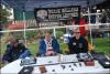
Unfortunately there were several items stolen from the Ballard's at a show this weekend in the Salinas, CA area. I will be posting more pictures of the stolen items as they're available. Also included in the pictures is an image of Duane's maker's stamp which is on all of the items from what I know. Please keep an eye out and if you see anything let me know and I'll pass the information along to them.