


cmantz
-
Posts
175 -
Joined
-
Last visited
Content Type
Profiles
Forums
Events
Blogs
Gallery
Everything posted by cmantz
-
I am in the market for a used leather sewing machine. Right now I will be sewing horse tack....halters, nosebands, breastcollars, headstalls, etc. Nothing too thick....the majority would be under .5" thick. At some point I might want to sew leather corners onto wool saddle pads and they are usually about 1" thick...but I do have someone that can do that for me and this is not something I expect to do too often. I was looking at the Cobra Class 4 machine...long arm but wonder if that is really overkill for what I need. I talked to a local machine guy and he recommended the Adler 467. I can get a refrub head with new table, motor, speed reducer for $1195. My thinking is that I could always start off with a flat bed machine and then sell it, if and when I need to upgrade to a cylinder arm. thoughts? suggestions?
-
I see horse tack made with LV material...I assume it is fake. So it is available for purchase somewhere.
-
 I am just getting started also, but all of my daughter's tack is 2 ply. I have seen it backed with latigo leather and I have also seen it backed with just HO leather. In fact, a friend recently bought a new set from Luan's Leather and all of theirs is 2ply HO leather...looks to be about 8 oz. for each layer. I am going to try my hand at a breast collar and headstall soon...my daughter is patiently (or not so patiently) waiting for me to figure it out As far as patterns...I know some recommend the one that Tandy sells. I haven't bought it. I was planning on just using an old breast collar we have as a pattern.
 -
I am considering buying a spot setter. Does anyone have input or suggestions? I will be setting spots (1/4" and 3/8" mostly) into leather halters, bridles, breastcollars, etc. I have seen the Weaver Little Wonder in their catalog but also ran across the hand/foot machine that Standard Rivet offers...just wonder if I need to spend $600 when I can buy the one from Weaver that will be less but do the same thing. Would love some input from those of you that have used these machines. THANKS!!
-
Which of the Liquitex paints do you use? Professional Colors (soft body or heavy body) or the Basics Value Colors? I am only painting areas of the leather (I am first laser engraving and the following up by painting a name or some scrolls for example) so I can't really mask it to apply a base coat. Since I have to hand paint with a small brush, I would like a product that will give good coverage with only one coat of paint. Thanks! Chris
-
Art...I am curious if you have any tips on how to achieve very bright colors with acrylics on dark leathers. I am VERY new and have played with the Angelus silver on veg. tanned leather (not even a dark color) and really wasn't happy with coverage...but then again, maybe I am doing something wrong. I have seen some pretty intense designs painted leather. I can not image the artist putting multiple coats of paint on it to achieve good opacity.
-
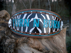
Love the look of the case you uploaded today. Mind me asking how you got the "sponged" look?...and what kind of leather you started with? Oh..and I do LOVE the items with the horse hair!!!
-
What Do You Print On Your Business Cards?
cmantz replied to Chavez's topic in Marketing and Advertising
My suggestion...keep your business card CLEAN and SIMPLE. With today's full color printing capabilities and companies like Vista Print (UGH!!) you can get nice, full color, two sided cards inexpensively. REMEMBER..your business card is your FIRST contact with someone. DO NOT go handing out homemade, flimsy cards! BAD, BAD idea. Make sure it is a card that feels good in your hand. Cheap, thin cards I just want to pitch. I mean, if someone can't at least pay for nice cards, what does that say about their business? I like to keep the front pretty clean...logo and tagline, contact information (address, website, phone numbers)...use the backside to list what you do. If you can incorporate pictures of your work...especially for the background of a full color card, that would be ideal. To me, business cards are like any other form of promotional items...if you just buy them because they are cheap, people won't use them and they will throw them away. Invest in better promotional products that people will actually use and you will get a better RIO (return on investment). Just my opinion... -
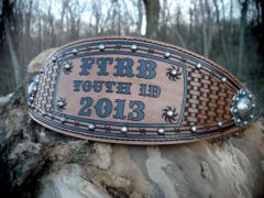 The whole design is lasered at the same time. As of right now I am charging $40 for a basic lasered design (like the Flickerwood Youth Rodeo sample I posted)...no color fill...no spots. For this one shown I am charging around $50-55.
 -
 Actually this is machine sewn. At first I thought about using the to cut the holes for the stitch but decided it was still too much work to hand sew. Good idea about the spots. May need to try that and see how it works. It would take some fine tuning to get the settings just right to go through but not make too big of a hole. This was also one of the first using the hand spot setter....I have decided to let my husband do that from now on. I can't seem to hit the setter square on the head and my spot ends up shifting.
 -
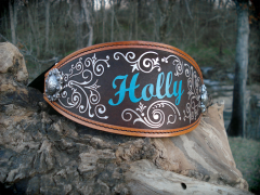
I hand painted it. I used the silver Angulus paint and what a PAIN!!! Had to give it two coats and still wish is was more "silver". Although it looks great in the picture but when you look at the actual one at a certain angle it doesn't have the opacity I would like. But it was my second attempt at painting so not bad. An artist I am NOT!!
-
From the album: Bronc Halters
laser engraved and hand painted using Angelus acrylic paints© TrendyTack 2013
-
From the album: Bronc Halters
laser engraved and hand painted using Angelus acrylic paints© TrendyTack 2013
-
From the album: Bronc Halters
laser engraved and hand painted using Angelus acrylic paints© TrendyTack 2013
-
I am very new to leatherworking and have only messed with bronc halters. I am ready to try some stamping and figure spur straps should be an easy project. I downloaded the free Tandy patterns. I have a couple questions: What thickness leather would be best (I have some 5-6 oz and some 8-9 oz)? Do I need to line the straps? I have seen some that are stitched...is this just for looks or are these made with two layers of leather? As for the billet, if I use the 8-9 oz. leather, do I need to skive the leather where the buckle will go? It seems like it will be really thick if I don't. Where do I find pattern that has the newer style spur straps with the strap & bib?
-
Where does someone find a pattern for this type of strap?
-
yes, laser is a fun toy to play with as it can do so many things. We have had ours for probably 6-7 years and have always wanted to try leather. Finally gave it a try this last month and WOW...so cool. I will say that I like the horse butt lasered better than the veg tanned. I uploaded two pictures in the gallery of our first attempts at lasering. I have another that I am about finished with that I will post. I did try to laser cut an outline (basically in place of the swivel knife) and then tooled and I think it can work...although my first attempt I think I cut too deep. I am not great with the tooling and TERRIBLE with the swivel knife. But as with anything...I need to practice, practice, and more practice. I have a Universal 30 watt laser.
-
Oh...let me know how that goes. I have a laser engraver so I have been playing with lasering leather. I am going to try using laser mask (that we use for sandblasting) on the top of the leather and then paint as a stencil.
-
I will say I haven't tried it but I wouldn't have expected it to leave a residue. Interesting that it did. But yes, definitely pricey.
-
Yeah..I was thinking DTG (direct to garment) also. I have seen the digitally printed heat applied vinyl being used on leather. It is fine for the promotional portfolio a company wants to give to customers...but I can image it working too well for garments, shoes, purses, etc. Sublimation would require the leather to be treated first in order to accept the sublimation ink and would only work on light color leather as sublimation ink is transparent. Edited...my bad...didn't realize this thread was old! LOL
-
I don't know how many of you have cutters out there to cut your templates. But for those that do you might want to consider a product called Sticky Flock. It is used for making rhinestone templates for apparel. The nice thing about Sticky Flock is it is fairly thick and it has a sticky back that is repositionable and won't leave a residue on your item. Another option is oil board. Some people have mentioned cutting this in their cutter. I have not tried it but I have cut it in my laser. MUCH less expensive than acrylic. You can get oil board from Uline.
-
I found Standard Rivet and for spots, they definitely will be who I order from when I need to reorder. But the the rim set rhinestones, they were REALLY expensive. If you are ordering their "bling in the ring" then you probably want to check out Dreamtime Creations out of Springfield MO as they are the ones that make them and they are about 1/2 the price.
-
DWC...that is an awesome idea!!! I hadn't even considered that. Now just need to figure out how to find one and how to contact them
-
Yeah..I saw them but thought the price was kinda high considering I can get Weaver halters online for $12-$15
-
Thanks Mike!