


Cyberthrasher
-
Posts
2,397 -
Joined
-
Last visited
Content Type
Profiles
Forums
Events
Blogs
Gallery
Store
Everything posted by Cyberthrasher
-
It sounds like maybe you got some split scraps or something. As if they kept the good side for themselves and sold off the flesh that was cut from the back. Do you have a picture of what it looks like to verify? A couple of good places to buy scrap leather bundles are Zack White and Springfield Leather. All the stuff I've purchased from Zack White were pretty heavy, where Springfield's remnant bags are usually a pretty standard mix of light to heavy weight.
-

"a Motorcycle Seat ?!" Out Of My Comfort Zone
Cyberthrasher replied to George B's topic in Motorcycles and Biker Gear
Yep, that's what I was hoping to see out of the pan. You can either stretch it over, or follow one of David's tutorials but just saddle stitch the two pieces together instead of lacing it. I would also use some closed cell foam (easily available as "gym foam"). That will match the customer's requirements and be pretty easy to get done. -
"a Motorcycle Seat ?!" Out Of My Comfort Zone
Cyberthrasher replied to George B's topic in Motorcycles and Biker Gear
I was thinking it was something like that. It sounds like he would be opposed to any kind of lace job then since that's what that usually ends up looking like. He's probably looking for a stitched construction. Honestly, so far at least, since you're doing saddles it doesn't sound like this would be too bad of a job for you. But, we'll wait to see what you're dealing with exactly . -
"a Motorcycle Seat ?!" Out Of My Comfort Zone
Cyberthrasher replied to George B's topic in Motorcycles and Biker Gear
If you post some pictures of what it is I'm sure someone will be able to help out. Being a hard-tail, I'm not sure if what you have would be a stock seat as the term "restored" implies. So, with that in mind I don't want to mislead you at all without knowing for sure what you're dealing with. Also, what do you mean by "piping"? -
Card Wallet With Money Clip
Cyberthrasher replied to AndyL1's topic in Purses, Wallets, Belts and Miscellaneous Pocket Items
I don't really worry about being inspired by others I do a similar "antiquing" method with my pig lining leather. I just cover the bottle with one of my trusty disposable shop towels (the blue ones) and splash it up onto it. Then I just randomly blot the leather with it so it gets a cool antiqued marble look. Really adds personality to untooled leather. I'll have to try that with a damp sponge too. -
Card Wallet With Money Clip
Cyberthrasher replied to AndyL1's topic in Purses, Wallets, Belts and Miscellaneous Pocket Items
Andy, I've been admiring those for a few days on facebook I've actually been thinking about doing some small stuff like that for the same reasons, but now I have to figure out to not look like I ripped you off!! Really though, those are super classy and the perfect addition to complement the new brand name. -
For further warm and fuzzy feelings..... I just checked everything out with the ssl certificates and it is all verified and functional (though I'm still getting errors in my Firefox - but that's a different story). it's all secure and valid with a full certificate chain from known issuer.
-
That's EXACTLY what I like to hear
-
Bro, you crack me up so much!! But I'm signing the petition too because I whole-heartedly agree
-
I can never come up with artwork for my own stuff, but designs for customers flow so easily.
-

Then you need to treat yourself like a customer.
-
-
I forgot about the freebies there. Too bad I don't buy anything from Tandy. I wonder if Kevin at Springfield will start offering some of the same perks???
-
1St Seat And Some Finishing Questions
Cyberthrasher replied to Miloradovich's topic in Motorcycles and Biker Gear
One of the many reasons I started with leather myself. I still have knots on my head from constant smacks with a torque wrench while my friend was helping me build up my bike. Never been much of a wrench, but the world needs artists too so I think I'll be OK -
I could see the possibility of getting that color with black and saddle tan. I might use something with a little more brown in it to start with, like light brown or even mahogany. Whatever you use as a base, just add a couple of drops of black at a time to darken it up. I'd say something like a 20:1 ratio.
-
The question is, do I NEED another beveler........... decisions to be made
-
Thanks guys. He's eagerly awaiting the arrival as we speak.
-
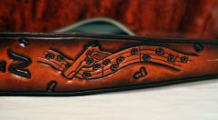
Guitarslinger strap - Closeup Front
Cyberthrasher commented on Cyberthrasher's gallery image in Our Leatherwork Galleries
 Thanks!!
 -
1St Seat And Some Finishing Questions
Cyberthrasher replied to Miloradovich's topic in Motorcycles and Biker Gear
DON'T WORRY ABOUT THE COLOR!!!! That is gorgeous and a PERFECT match to the bike. I'm really digging the ride too. Those struts are similar to something I was thinking about at one time -
Cool, I think I have that one loaded onto mine. Overall it's still a great site. It just seems like you've duplicated a lot there by having things on both the start page and their own product pages.
-
Shotgun Concho Dog Collar
Cyberthrasher replied to HellcatLeathers's topic in Collars, Cuffs, Leashes and Leads
Cool. I was just wondering last night how those conchos look in real life. Too bad for the customer. But, goes to show why we require down payments -
Noticed you don't have many responses yet. Those of us in the US may find it hard to recognize your web address in the name there, so I'm putting a link here for others to see it easier (hope you don't mind). I'm not sure it was clear that the translator page links to your page in a translated version. http://www.nordlicht-leder.de As for critique, the layout looks good for the most part. I will say that such linear pages like the home page are kind of hard on people's attention spans. It looks like you have things pretty well categorized on the left navigation menu, so it might be better to slim down the home page and place things in the dedicated pages for those types of items. I think the home page should be short and brief with a focus of driving people to the aspects of the page that they're interested in. One idea I was working on for mine was a front page slider for new items that linked to that items description on it's product page. That way if people are interested in your steampunk bag, they can click and go check out some more details, but if it's not their thing, they don't have to scroll past it to find the items they are interested in. Do you mind me asking what you're using for an image/gallery plugin? I really like the way those are presented and I keep on vowing to finish my website someday.
-
 Thanks!!
 -
I hadn't thought about matching the color. I suppose if it were really custom it might be a little bit of a pain. I'm just glad to hear that others think it's a viable idea since I hadn't had a chance to try it yet
-
Why 4 rings? Are you thinking for her to make up all the space with the rings, or adding new leather to make up the length and using the ring as a method of attachment? I was thinking the latter.
-
YEAH!! That's EXACTLY what I was picturing. It could even be done with some plain brass rings too, but that would open it up quite a bit for the length. I don't know what you have locally, but they carry square rings at my local Joanne's Fabric, and most likely Micheal's Crafts as well.
-
Ah, just noticed this. That would explain my status message then