


Tina
-
Posts
1,873 -
Joined
-
Last visited
Content Type
Profiles
Forums
Events
Blogs
Gallery
Store
Everything posted by Tina
-
 Hi, I only use Angelus finisher and I'm more than happy with the product...Satin, Matte and Gloss (they also have High Gloss) I buy it in quarts for $18 and from this place where the prices seams to be the best. Really good service too, and no, I have nothing else to do with the place other than being a happy customer. http://turtlefeather...s-products.html Scroll down around half the page and you'll find the Acrylic Finishers.
 -
Now, I don't know about them Sharpeis but... I have painted leather with artist oil pait with great resaults. I did how ever let it dry for 4-6 weeks before sealing it with super sheene, I did save the piece just to have it around and to be checked every now and then and it is still perfect after at least 2 years now. I hope this help you allong the way some:-)
-
Go to google image search and paste in: Victorian Calligraphy Now you should have some more pattern options :-)
-
Hi and Welcome:-) First I would sit down and think about what kind of carving I want to do in general. The kit is a good start for flower carvings but there is places to get the tools to a better price. Ebay is one and why not try these guys out, I'm happy with them: http://stleather.com/
-
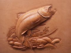 I Love your fish Clay, very lifelike...I can almost feel the smell and taste of the fish ontop of the camp fire
 -
Could it be Bruce Johnsons pattern? Here's the link with the PDF file http://leatherworker.net/forum/index.php?showtopic=14808&st=0&p=91132&hl=+bruce%20+johnson%20+purse&fromsearch=1entry91132
-
Try this place for a hot foil stamp (or other): http://www.phillipsengraving.com/Magnesium_Dies.html I and many other here have bought metal Makers Mark stamp from them and they do have a wide range of stamps/materials they work with.
-
Hi Tom, the only thing that comes into mind is letting each layer of white dry before the next. It might not get quicker but I think you might save paint and not risking to reshape your mask due to to much water. The ide I got in my head was that each layer makes a acryllic small seal on the leather, making each next layer just ending up on the surface (?) Love seeing your work:-)
-
Hi Spinner, I like the overall look of the logo but I have to put a small damp on it...This will work fine for some things and not as good for others. The text is way to small compare to the logo itself and will just wanish on a stamp for example. The font is another thing, you want people to be able to read it right away, to capture their intrest:-) If you look around in the "logo world" all the good ones is "KISS", easy to read (if any text), easy to understand and often a very simplified design without any guesswork of the meaning of it. Also have in mind how big/small you want a makers stamp to be = How much of the space of your work the stamp is going to be allowed to take... Now, I'm with your lil sis (in-law) I don't get it, I wish but??? I hope this helps you a wee bit on your way to the logo perfection:-) My very best advice to anyone making a logo is: Take your time, once you have one you have to live with it, maybe for a very, very long time. My own logo tock 6 moths or so to create. Have a fab day//Tina
-
Absolutly:-) This will also get the acryllic a really good "dry" surface to attache itself to. If using spirit dyes, don't forgett to replace the fat in the leather by using neatfoot oil for example (and let this dry another 24h) then seal it with whatever you like to use, some of the sheenes, wax or...
-
Just A Few Things Of The Workbench
Tina replied to Tina's topic in Purses, Wallets, Belts and Miscellaneous Pocket Items
Thanks a load both :-) It's always nice when other enjoys your work. Sparks: The scenes with the craftsmen is from an old (very old) wood stave church in Norway, it is carved in wood and me toooooo Loves it :-) Eventually I will make my own craftmen scenes I just did not have enough time doing these. -
This place gets my vote, I'm more than happy with the resault and it is made in metal :-) http://www.phillipsengraving.com/Leather_Stamps.html
-
Another Christmas Present Done
Tina replied to BearMan's topic in Gun Holsters, Rifle Slings and Knife Sheathes
Wow Ed, I'm lost for words.... I'm a fan -
Som dom säger i USA, "You're welcome" ...och jag säger, "Tack för titten" :-)
-
...and Part Three And The Final One
Tina replied to Tina's topic in Purses, Wallets, Belts and Miscellaneous Pocket Items
Great Thank you Ed, I'm in the process now of making more of my own patterns for future project and hopefully it will come out OK, just need to find great leather supplier that woun't brake the wallet, that's hard on this side of the pond. -
Spinner...I would still be interested in one (or two depending on sizes) of wood from ya;-) And I would say it has to be space enough for both of your tools
-
...and Part Three And The Final One
Tina replied to Tina's topic in Purses, Wallets, Belts and Miscellaneous Pocket Items
Thank you Jordan, your kind words goes straight to my heart :-) I have loads of advantages, being an artist first (and a leatherworker by love) I'm just using the leather as a piece of canvas and it works (I hope) -
Hej Trox:-) Jag bor numer i Sverige och skickar härifrån så portot blir mindre till dig i Norge. Nej, jag ger Aldrig upp läder, detta är bara en hel bunt av mina dubletter som jag tog med mig i flytten från USA :-)
-
Great idea Spinner, I think you might have a product here and a market for it too in the same go I would buy one in a heart beat...This is just what my dremmel needs:-)
-
Love the "translation" The stamp with the mountains is something that came with an old starterset I bought on Ebay, I don't know how old it is? Most of these stamp is my duplicates, also bought in big batches on Ebay.
-
Just A Few Things Of The Workbench
Tina replied to Tina's topic in Purses, Wallets, Belts and Miscellaneous Pocket Items
Thanks a load people :-) I feels good being back in the craft again Bob, there's jusyt that manny scetches you can draw before you really need some leather to pound:-) -
...and Part Three And The Final One
Tina replied to Tina's topic in Purses, Wallets, Belts and Miscellaneous Pocket Items
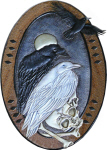
Thanks girls:-) I hope to inspire to some new master pieces...In all fairness, I have made collars in 10 years or so, tooled collars for abot 3+ so I have had a go at most versions of collars by now, I really need to ad pictures to my gallery *S* -
Not bad :-) oxo is just me being very lacy...It should have been också wich means something like "and that too" (and they both sounds the same). You see I'm still working an Ameican keyboard and that means I have to code all the Swedish letters å,ä & ö...To much work when in a hurry Not Ebay - Tradera, (Ebay Sweden could not compete with Tradera so they bought it a few years ago...)
-
Just A Few Things Of The Workbench
Tina replied to Tina's topic in Purses, Wallets, Belts and Miscellaneous Pocket Items
Thanks a million borh, I'm glad you enjoy them:-) -
Hello, om ni brukar kika in på Tradera mellan varven har jag just nu en massa tidningar/mönster, verktyg och annat till salu som oxo skickas från/inom Sverige/Skandinavien. Jag säljer ut mina dubletter och annat lädermaterial:-) http://www.tradera.com/auktioner/LethalWeapon Tack för titten//Tina