


RockyAussie
-
Posts
3,265 -
Joined
-
Last visited
Content Type
Profiles
Forums
Events
Blogs
Gallery
Everything posted by RockyAussie
-
Is there a font for Ivan Alphabet stamp set 8132-00
RockyAussie replied to RockyAussie's topic in How Do I Do That?
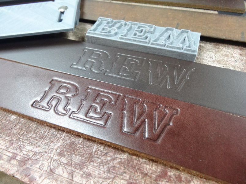
Hey Brian, thanks for the trouble. I thought I was going to be able to use the Saddlebag font shown below by @Bigjake80 (Thanks Bigjake) but on checking on what claimed to be Free to use on some font site, Deiter Steffmanns page appears to say otherwise. I decided that it would not help much with what I wanted to do between laser files and 3d print files etc so I decided to make my own. THAT took a lot of learning and time and mistakes I can assure you. I hope to come up with a metal set of letters for my font in the near future. The advantage is I can type it out to show a customer and then laser cut the outline if I want or just place the letters against each other and stamp out the words. Thanks for your input on this point @LatigoAmigo. After a LOT of playing with the letter style and spacings between each letter I have come up with a font that seems to work well with most every thing I have thrown at it so far. (still early days yet though) There is no kerning in my font only the same spacings between which is just over 3mm apart. I have copyrighted this font and hope to put it out there when I finish getting the metal stamps for it finished. Example below shows the laser cut masking tape on a trial. This pic below shows the impression possible with a 3D printed block I did with this font This next one shows that the guide I printed can use the Ivan letter set as well, in this case a C and can give a cleaner looking impression. If a font for the Ivan set were available I think it would be too sharp to get a good line up over the masking tape and is also why I decided to make the width/thickness I did when I designed the font. Thank you again for the help you have offered and again to Rockoboy and Bigjake.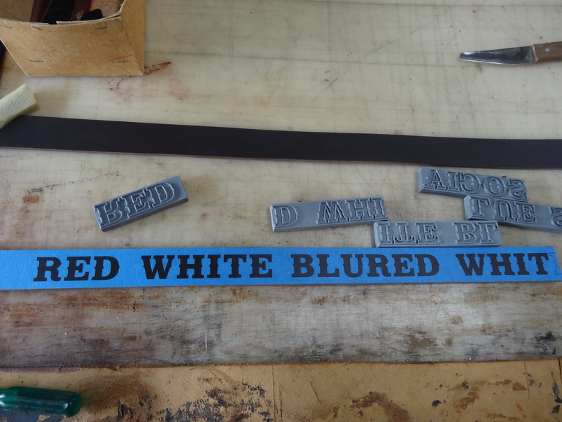

-
Ok I did it
-
peel out the pieces
RockyAussie commented on RockyAussie's gallery image in Gallery- Our Leatherwork
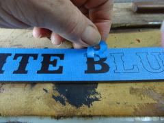 yea I did get a bit of that but I just stuck some new tape down over a couple of times before painting and that cleaned it out nice.
 -
From the album: Making and painting letters
-
From the album: Making and painting letters
-
From the album: Making and painting letters
-
From the album: Making and painting letters
-
From the album: Making and painting letters
-
letters laser cut through masking tape
RockyAussie posted a gallery image in Gallery- Our Leatherwork
From the album: Making and painting letters
-
From the album: Making and painting letters
-
From the album: Making and painting letters
-
From the album: Making and painting letters
-
I thought I had somethin worth posting in the gallery this morning and see this...........Daaaam......that is just toooo good. Maybe tomorrow.
-
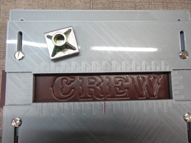
Yes the letters are splayed wider at the bottom. As I tried to say above the height I gave from the base of the letter is 2.5mm and the base width of each letter is 2mm wide extruded up with a taper angle of 15 degrees inward from both edges at the base of the letter. In AutoCad this can be done in several different methods but in this case I started with the letter line in the middle and offset from that 1mm either side of the polyline. This helps for doing the laser cutting later which has to be a single line with no thickness otherwise the laser cuts both sides of the width of the line. Pain in the but....but sort of like solving a puzzle I guess. To make it more complex the dxf file that goes to the laser can not use polly lines and so must all be exploded first back into all of the broken up lines again. Until you get familiar with doing 3d drawings it may all sound a bit confusing to start with. Letters that have no holes in them like an A or an O can be just done at 15 degrees but for ones that have the holes the inner lines should taper at -15 degrees.They are best done first in order to make them easier to subtract the solid parts you need to get rid of as you go. Sorry if this is confusing yet but I will try and do more of a step type of process with some pictures when I finish the above project next week I hope. Thanks for the thoughts dikman. Amongst several issues I am now dealing with a bad case of rheumatoid arthritis which for a few years I have been ignoring and taking anti inflamitories etc to keep it at bay. Now I find out it can paralyse and even kill you. GREAT... and they have done enough scans now in three months to equal nearly a thousand x rays. If I don't have the big C already , I probably will get it now anyway. They wonder why I don't want to go in every time they call me for another Non urgent appointment. That's the end of my bitchin on this subject for now.
-
That is interesting and thanks for sharing. I am curious about not having a key way on the little pulley at the moment.
-
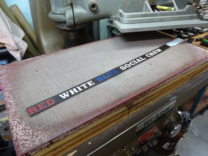
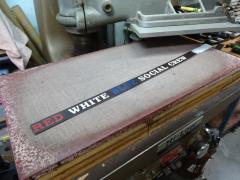
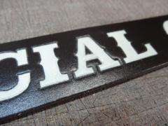
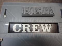
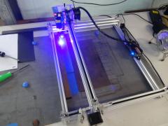
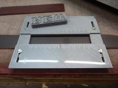
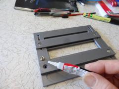
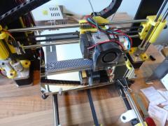
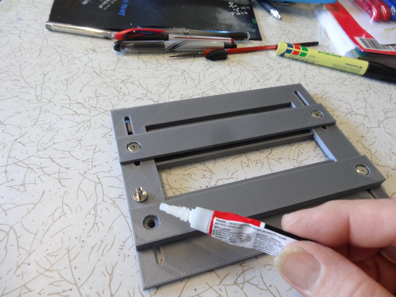
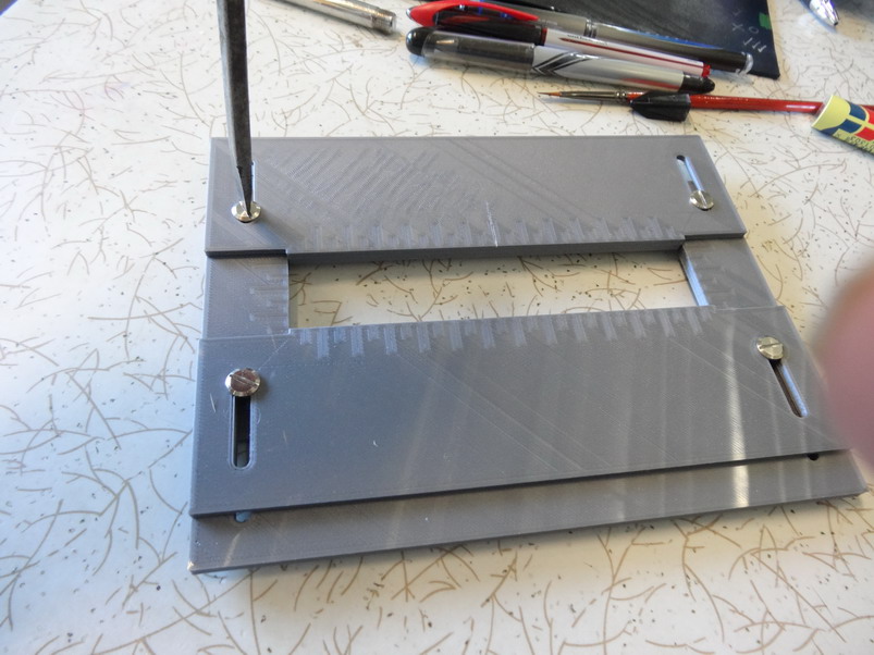
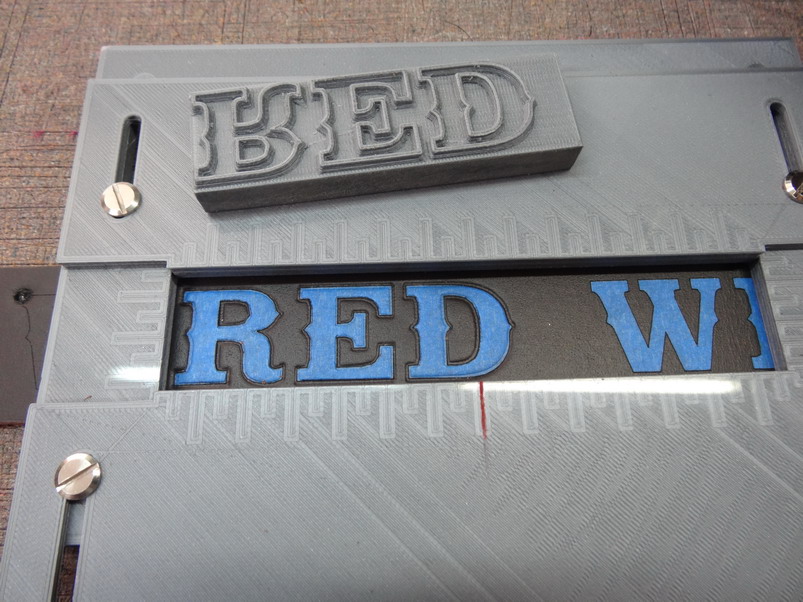
Congratulations @chrisash on getting a very worthwhile tool. Be patient and do a lot of getting used to your settings and how the can vary before trying to do too much too quickly. Lots of things like your temperature in different colour filaments and ideal bed temperatures for the given filament and a hundred other various adjustments, can make a big difference to the outcome. I have had a lot of health issues of late and along with a huge backlog of work to catch up on I am sorry I am limited to the help I can give you in a hurry. In order to help some with the above questions I can say that the pla+ has worked excedingly well with the stamp project I am currently working on. I am still working on this project at the moment and will give a more full break down of it over the next week or so but here a a few pictures to help show you more of what I mean. I should start by saying that the stamps in this case are a letter set that I have designed a font for that I want to use for stamping onto belts that have to be painted in different colours as well. This involves the use several different processes including the 3d printer and a 2.5 watt laser as well as a clicker press and so on. First I designed a guide to hold the letters which were going to be used with the Ivan letter set. As I could not get a font for the laser work I then designed my own. The following pic shows my stamp test held up well to the hammering down with the clicker press. This one shows that the Ivan letter set is thinner and a bit smoother but I have not bothered to smooth out the pla+ printed ones either. This one just shows where I am testing the line up of the laser cut masking tape with my stamp. AS you see I did not have it quite aligned as needed and I have to say that the thickness of the letter width is only .77 mm so it does take a little patience. There's that word again. Oh nearly forgot.... the letter height I used 2.5mm high off the block and 2mm wide at base extruding up at -15 deg inside the letter and 15 degrees outside the letter. I work in Autocad unfortunately so I cant help much in the other programs. Brian


-
Is there a font for Ivan Alphabet stamp set 8132-00
RockyAussie replied to RockyAussie's topic in How Do I Do That?
Thank you all. To try and explain better ....I have the stamp set already that I want to use as in the below picture. As they come in the box each letter is not able to be placed up against the next letter without having too wide a spacing on most. As Mike says it more correctly the kerning needs to be done. Now what I want to do is print out the letters to size from a font that is the same as the set and then shave the stamps down in order be able to put them up against each other and stamp a few letters in my clicker press at the same time. This I wanted to do by 3D printing a jig to hold the stamps in the correct place over the belt strips. At the moment I'm thinking my best option is to stamp out the letters right through a piece of 1mm leather thickness and use it as a guide line up on all the belts again held in a jig perhaps.. This at least would only require getting the kerning right the one time. I will check out the Circus fonts you mentioned Mike and let you know if I have any luck. Thanks for the tips on the colouring as well. As the colours are red white and blue on black I think I will need to surround the letters with white or silver more likely as the white would look strange otherwise. Sure did but I'll get em educated right somehow ....... Can you believe in the middle of a hundred acres I have to turn the TV up to drown out the music sometimes. A few shots normally quietens em down a little or the cops show up to save em or something. . Thanks again ...I will post some pics as I work it out.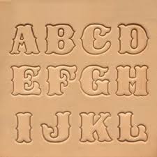
-
Is there a font for Ivan Alphabet stamp set 8132-00
RockyAussie replied to RockyAussie's topic in How Do I Do That?
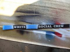
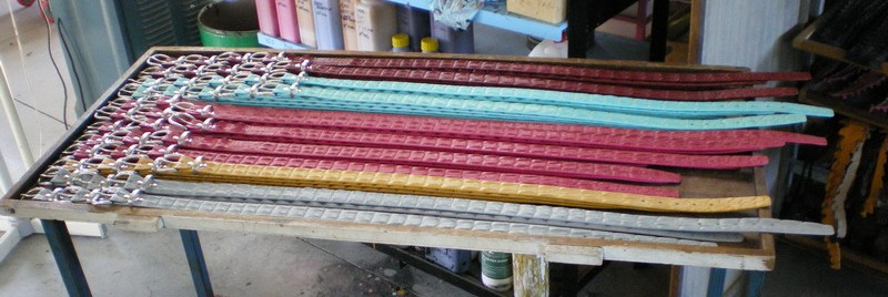
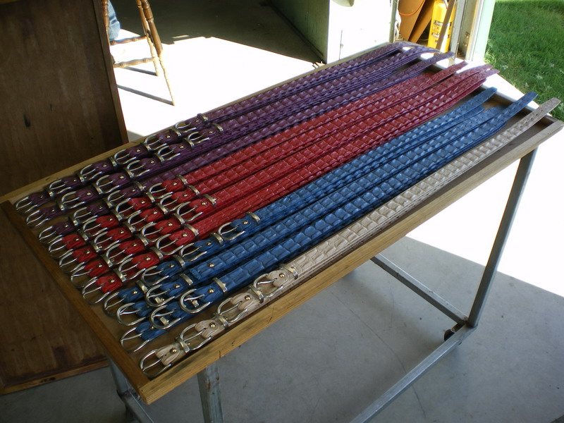
BUMP BUMP anyone ............Am I gotta do all this by hand on every belt? There are 5 words with 22 letters on each belt and I have to paint the words in different colours as well. This is why I moved outer town I remember now. 10 years ago it was about 1/2 hour out ....now they have crept up and are starting to surround me. HELP. -
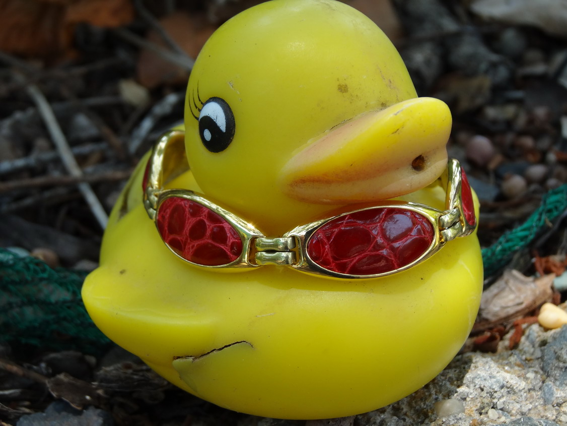
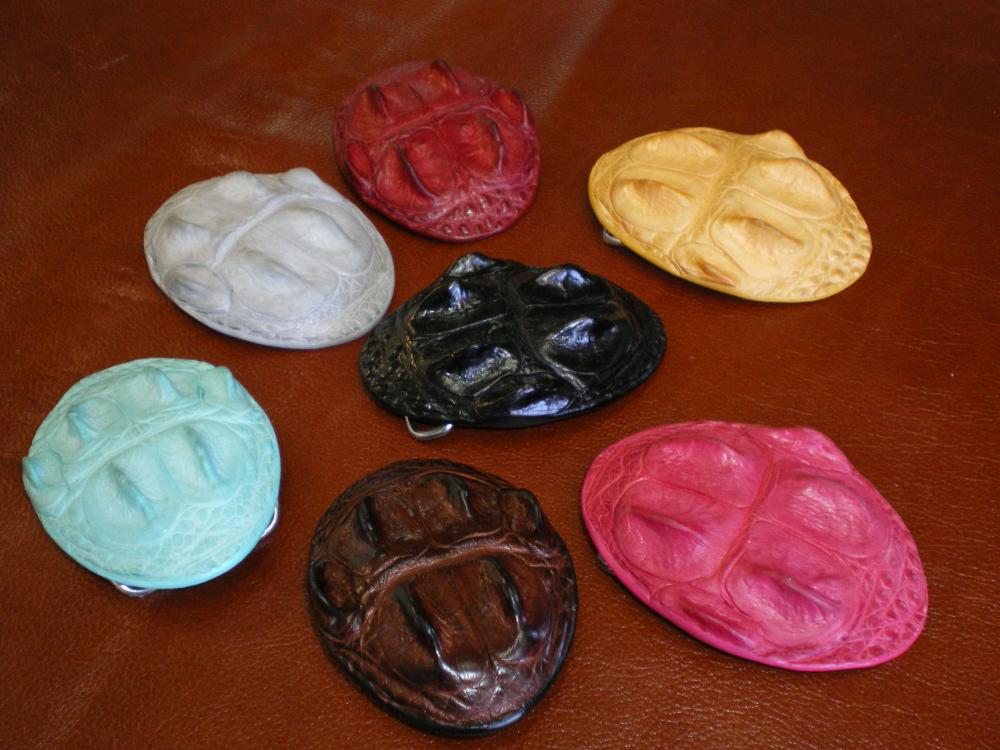
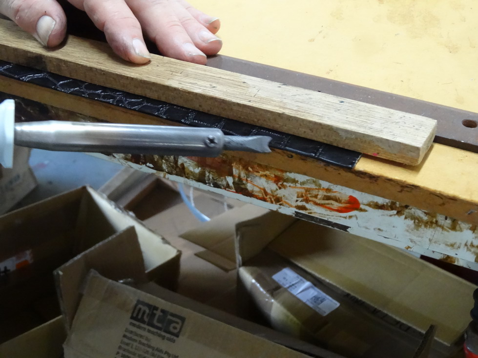
I cant say anything about fiebings acrylic paint as I haven't used it myself. I have used a lot of others in the past and can only advise my thoughts from that. Being a dog collar I would been tempted to use a spirit dye first as the paint generally break down in time with this sort of use. I notice that the edges are fairly square except around the buckle area and I think the metal keeper has a sharp edge on the inside of it that is scraping the paint off each time it is done up perhaps. Whenever I do coloured edges I start by rounding of of the edges by sanding and not making it too smooth as some others seem to do. The reason is that you want the paint to get down in the fibres and really hang on. This is normally followed by a couple of coats of paint until it is not looking too rough any more. I then iron this in with a temperature controlled soldering iron but it can be sanded back to smooth if that is easier for you. I prefer the iron in method on most paints as it tends to have a more durable finish in the longer term. After that I normally apply a couple of more coats to really make it look good but probably not needed on a dog collar really. I normally do this for crocodile products as in picture below.To finish I just polish with a clear wax.
-
Is there a font for Ivan Alphabet stamp set 8132-00
RockyAussie replied to RockyAussie's topic in How Do I Do That?
Major failure on the recognition. Had some fun pulling all the broken up letter pieces to make them into full letters and the results were ..........not even close. I would have thought that somebody would have done one of these sets by now but there you go. -
Is there a font for Ivan Alphabet stamp set 8132-00
RockyAussie replied to RockyAussie's topic in How Do I Do That?
Thanks Mike I will give it a try. Been awhile.... good to see you back again. -
Could you describe what type of leather you used to start with? Some pictures may help.
-
That is some pretty good looking work there Hanys , thank you for sharing your talent with us.
-
I am wanting to know if anyone has a downloadable font for the Ivan alphabet stamping sets in either 8132-00 or the 8131-00 or the 8100-00. Has anyone made one perhaps or know where I can get one? I am wanting to shave the stamps down in order that I can lay out the stamps in a line and have them correctly spaced. This page shows the stamp sets I refer too. http://www.ivan.tw/index.php?route=product/product&cid=12
-
Help choosing my first industrial machine
RockyAussie replied to MStone's topic in Leather Sewing Machines
That is correct and the first thing I do in a design is check the measurements of the possible and work my design to that. I have a 335 as well and the 331 allows me a lot wider range of possibles as to how I want the finished product to look. Some here may argue and I hope they do as I would love to learn something new always.
